When we talk about LinkedIn post specs, we're really talking about the technical rules of the road for your content. This includes things like the 3,000-character limit for text posts, the ideal 1200x627 pixel size for images in a link preview, and the 10-minute maximum for native videos.
Following these guidelines is non-negotiable if you want your content to look sharp and professional on every device. It’s what prevents that perfect image from getting awkwardly cropped or your video from failing to upload. Getting these details right is simply foundational to building a strong presence on LinkedIn.
Your Quick-Reference Guide to LinkedIn Post Specs
It can feel like a lot to keep track of all the different content formats on LinkedIn, but it all boils down to understanding the core specs for each. Every format, whether it's a straightforward text update, a multi-page PDF carousel, or a polished video, comes with its own set of rules. Nailing these specs from the start means your message gets delivered exactly as you intended, without any weird stretching, blurry visuals, or crucial information getting cut off.
Think of this guide as your go-to checklist to run through before you publish anything. To get us started, here’s a quick visual that lays out the core requirements for the most common post types.
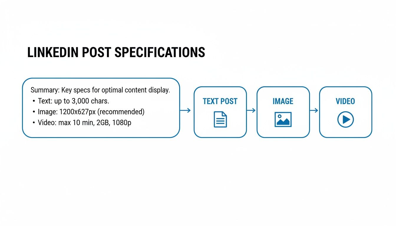
As you can see, while a simple text post gives you a ton of room to elaborate, visual formats like images and videos demand that you stick to much stricter technical guardrails. I’d recommend bookmarking this page so you can find these numbers easily. Getting this stuff right is the bedrock of any successful LinkedIn content strategy, and in the sections ahead, we’ll dive much deeper into each format.
For a quick overview, this table summarizes the most important specs you'll need to remember.
LinkedIn Post Specifications at a Glance
| Post Type | Key Specification | Recommended Value | File Size Limit |
|---|---|---|---|
| Text Post | Character Limit | Up to 3,000 characters | N/A |
| Single Image | Dimensions (Square) | 1200 x 1200 pixels | 5 MB |
| Link Preview Image | Dimensions | 1200 x 627 pixels | 5 MB |
| Video Post | Duration | 3 seconds to 10 minutes | 5 GB |
| Document/Carousel | Page Limit | Up to 300 pages | 100 MB |
Keep this table handy as you create content, as it covers the most common formats. We'll explore more nuanced details for multi-image posts, video codecs, and other advanced specs further down.
Quick Reference Sizes for Every LinkedIn Content Type
Need just the pixel numbers? This comprehensive table covers every LinkedIn content type in one place, from feed posts to profile assets to company pages.
| Content Type | Recommended Dimensions (pixels) | Aspect Ratio | Max File Size |
|---|---|---|---|
| Feed Post Image (Square) | 1200 x 1200 or 1080 x 1080 | 1:1 | 5 MB |
| Feed Post Image (Landscape) | 1200 x 628 | 1.91:1 | 5 MB |
| Feed Post Image (Vertical) | 1080 x 1350 | 4:5 | 5 MB |
| Carousel Slide (Square) | 1080 x 1080 | 1:1 | 100 MB (total) |
| Carousel Slide (Vertical) | 1080 x 1350 | 4:5 | 100 MB (total) |
| Native Video (Landscape) | 1920 x 1080 | 16:9 | 5 GB |
| Native Video (Portrait) | 1080 x 1920 | 9:16 | 5 GB |
| Native Video (Square) | 1920 x 1920 | 1:1 | 5 GB |
| Link Preview Image | 1200 x 628 | 1.91:1 | 5 MB |
| Article Cover Image | 1200 x 644 | 1.86:1 | 10 MB |
| Profile Photo | 400 x 400 | 1:1 (circle crop) | 8 MB |
| Personal Banner/Cover | 1584 x 396 | 4:1 | 8 MB |
| Company Page Logo | 300 x 300 | 1:1 | 4 MB |
| Company Page Cover | 1128 x 191 | ~6:1 | 4 MB |
Bookmark this page and come back to it whenever you're creating new LinkedIn content. Getting these numbers right from the start prevents awkward cropping, blurry images, and failed uploads.
Text Posts and Character Limits
While LinkedIn gives you a generous amount of space for your posts, up to 3,000 characters for a personal profile and 700 characters for a Company Page, the real magic happens in the first few lines. The most important number to remember isn't the maximum limit; it's what people see before they have to click "...see more."
This initial preview is your hook. It’s your one shot to grab a scroller's attention and convince them your post is worth their time. Get it right, and you've earned a reader. Get it wrong, and they'll just keep on scrolling, leaving your brilliant insights unseen.
Nailing the "See More" Cutoff
The exact point where your text gets truncated can differ slightly between the desktop and mobile app, but a safe bet is to focus on the first 210 characters. Think of this as roughly three to four lines of text. Your entire goal with this opening is to make clicking that "...see more" link irresistible.
So, how do you write a hook that works? It’s all about creating an itch that only the rest of your post can scratch. You need to spark curiosity, make a bold claim, or ask a question that your audience wants to see answered.
Here are a few proven formulas for those crucial first 210 characters:
- Lead with a startling statistic: "A wild 80% of B2B social media leads come directly from LinkedIn. But here's the one thing most people get wrong..."
- Present a common pain point: "Ever feel like you're shouting into the void on LinkedIn? If your content isn't connecting, the problem isn't your ideas, it's your opening line."
- Make a contrarian claim: "Forget everything you've heard about posting daily. It's a myth. I'm going to show you a smarter, less time-consuming way to grow."
Each of these examples creates an "information gap." The reader is left wondering what comes next, and the only way to find out is to click. For a deeper dive, check out our LinkedIn post character limit in our detailed guide for more advanced tactics.
Make Your Text Easy to Read
Once you've earned the click, don't squander it with a wall of text. Huge, dense paragraphs are intimidating and a sure-fire way to lose your reader's attention, especially on a phone. The key is to use formatting to make your post scannable and easy on the eyes.
Pro Tip: Embrace white space. Use short, single-sentence paragraphs and add line breaks between them. This simple trick makes your content feel much more approachable and digestible, which is critical for mobile readers.
Break up your points using bullet points, numbered lists, or even a few well-placed emojis. This not only improves the overall reading experience but also helps your key takeaways pop, making it more likely that people will engage with a like, comment, or share.
While LinkedIn technically lets you write long-form posts right in the feed, the data consistently shows that shorter, scannable posts tend to get more traction. Most experts agree the sweet spot for engagement is somewhere between 150 and 250 words. That's enough room to add context, build your case, and include a clear call to action without making your audience's eyes glaze over.
LinkedIn Image Post Size and Dimensions
Visuals are what stop the scroll on a crowded LinkedIn feed. If your images are pixelated or awkwardly cropped, it looks unprofessional and undermines your message. Nailing the correct dimensions is a non-negotiable part of mastering the specs for any LinkedIn post.
The recommended LinkedIn image post size is 1080 x 1080 pixels (square) or 1200 x 627 pixels (landscape link preview). Here are the exact image dimensions for every feed orientation, so you can pick the right one before you design.
| Image Type | Dimensions (pixels) | Aspect Ratio | Max File Size |
|---|---|---|---|
| Square (recommended) | 1080 x 1080 or 1200 x 1200 | 1:1 | 5 MB |
| Landscape / link preview | 1200 x 627 (or 1200 x 628) | 1.91:1 | 5 MB |
| Vertical / portrait | 1080 x 1350 | 4:5 | 5 MB |
| Minimum width | 200 pixels wide | Any | 5 MB |
The square 1:1 format is the safest all-rounder, the 4:5 vertical takes up the most space on mobile, and 1200 x 627 is the classic size for the thumbnail that shows when you share a link. Supported file types are JPG, PNG, and non-animated GIF.
When you're only posting a single image, the aspect ratio you pick has a huge say in how it shows up on different devices. While LinkedIn is pretty flexible, a few go-to sizes consistently deliver the best results.
Mastering Single Image Posts
The best dimensions for a single image really come down to what you're trying to achieve. A square image, for instance, takes up a lot of screen real estate on a phone, which makes it a fantastic choice for grabbing attention.
- Square (1:1 Aspect Ratio): The sweet spot here is 1200 x 1200 pixels. This format looks great on mobile and displays perfectly on desktop without any weird cropping.
- Landscape (1.91:1 Aspect Ratio): Go with 1200 x 627 pixels. This is the classic size for link preview images, making sure that when you share an article, the thumbnail looks sharp and clean.
- Vertical (4:5 Aspect Ratio): For a more mobile-first approach, 1080 x 1350 pixels is ideal. This is the tallest format LinkedIn will display in full in the feed. You can technically upload a super-tall 9:16 image (like an Instagram Story), but LinkedIn will crop it down to a 4:5 ratio in the feed. To avoid surprises, always keep your key visual elements within that 1080 x 1350 px frame.
Key Insight: A simple but effective rule of thumb is to always keep the most important parts of your image, like text or a key focal point, centered. This way, you don't have to worry about it getting cut off, no matter how someone is viewing your post.
Arranging Multi-Image Posts
When you upload more than one image, LinkedIn automatically creates a collage for you. How it looks depends entirely on how many images you add and whether they're horizontal or vertical. For example, two landscape images get placed side-by-side, but two portrait images will stack on top of each other.
To keep your post looking polished, it's a good idea to use images that all share the same aspect ratio. When you mix and match different orientations, say a vertical and a landscape, LinkedIn's automatic collage builder takes over and often crops your images in unflattering ways. Your tall, vertical shot will almost certainly get its top or bottom chopped off. The easiest way to maintain control is to make all your images the same aspect ratio. A really common and effective tactic for a four-image post is to use four square (1:1 ratio) images. This creates a tidy, balanced grid that's easy on the eyes. For a more detailed look at creating compelling layouts, check out our complete guide on LinkedIn graphics dimensions and our detailed post size guide.
And don't underestimate the power of visuals. We know from recent data that images on LinkedIn can double the number of comments compared to text-only posts. In fact, global engagement rates have hit 3.85% in 2026. You can dig into more stats like these in the latest social media benchmarks on Social Insider.
Finally, always keep the technical limits in mind.
- Supported File Types: You can use JPG, PNG, or non-animated GIF files.
- Maximum File Size: For a single image, keep it under 5 MB.
Following these specific specs for your LinkedIn posts ensures your visuals don't just get a passing glance. They command attention with the professionalism your brand is all about.
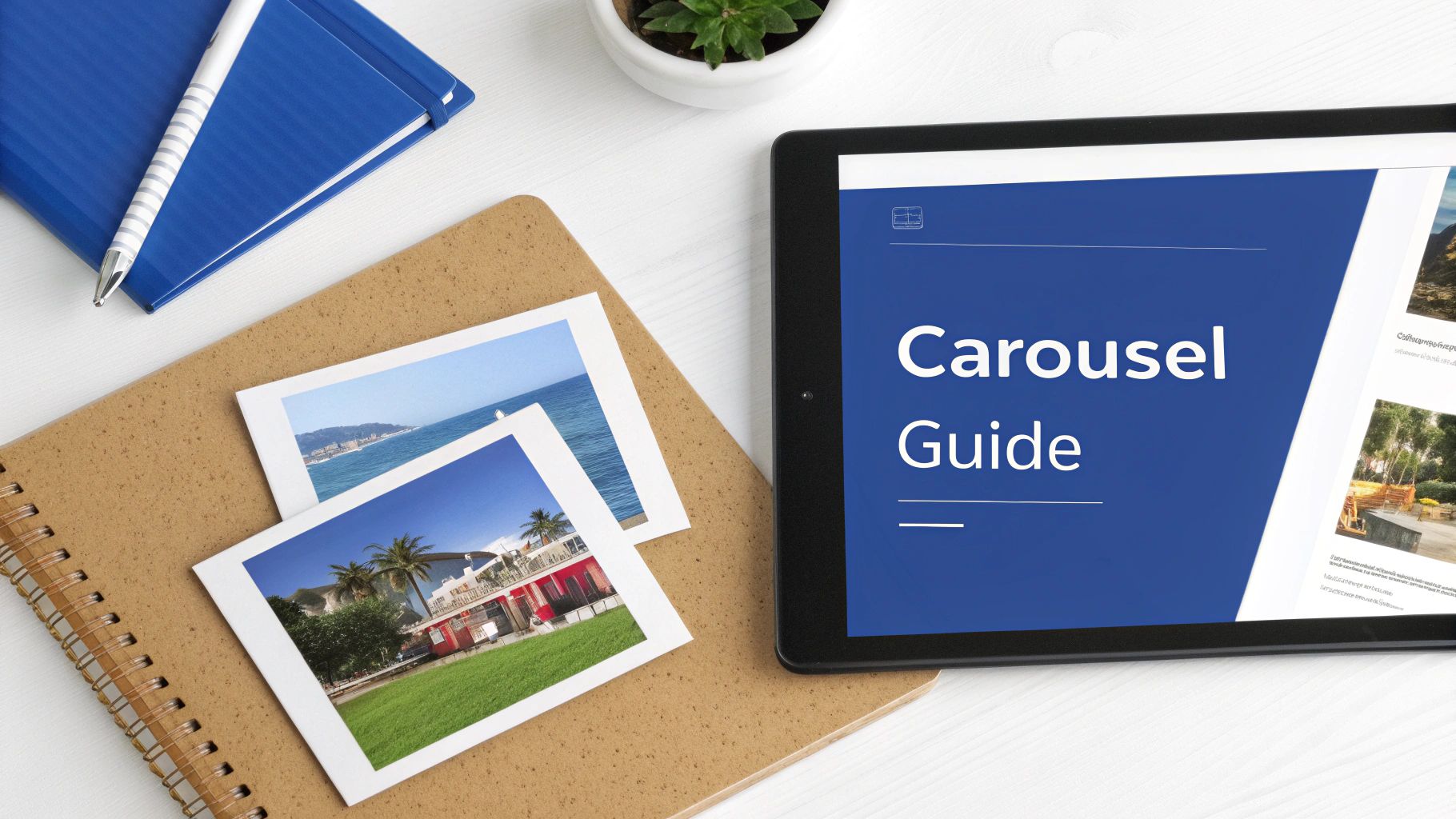
Getting the Most Out of LinkedIn Carousels
If you're looking for a content format that consistently drives interaction on LinkedIn, look no further than the document post, better known as the carousel. This format is a powerhouse for engagement because it packages information into a clean, multi-page document that people can click through at their own pace. That slide-by-slide interactivity is a fantastic way to tell a story or teach something valuable.
Think about it: unlike a simple image or a block of text, a good carousel keeps a user's attention locked on your post for longer. That extended dwell time is a strong signal to the LinkedIn algorithm that you're sharing high-quality content. It's the perfect format for breaking down a complex idea, walking someone through a how-to guide, or presenting data in a way that’s easy to follow.
The Technical Nitty-Gritty
Before you get creative, you need to make sure your file is set up correctly. LinkedIn treats carousels like a presentation, so getting the technical specs right from the start is key to making your post look polished and professional.
Here are the hard and fast rules:
- File Types: LinkedIn accepts PDF, PPT, PPTX, DOC, and DOCX. Honestly, PDF is your best bet. It's the most reliable and universally compatible.
- File Size: Keep your document under 100 MB.
- Page Count: You can go all the way up to 300 pages, but please don't!
Just because you can have 300 pages doesn't mean you should. The most successful carousels are concise and focused. A short, punchy document that delivers value quickly will always beat a long, rambling one. Recent data shows that posts with fewer than five slides saw a 35% drop in reach, so aim for at least five slides to hit the algorithm's sweet spot. On the other end, anything beyond 15 slides tends to lose the audience's attention. The ideal range is 5 to 15 slides, long enough to deliver real value, short enough to hold attention all the way through.
Here is the full LinkedIn document and carousel post size reference in one table:
| Carousel / Document Spec | Recommended Value | Notes |
|---|---|---|
| Slide size (square) | 1080 x 1080 pixels | 1:1, the gold standard for feed |
| Slide size (vertical) | 1080 x 1350 pixels | 4:5, more mobile screen space |
| Aspect ratio | 1:1 or 4:5 | Avoid landscape, it shrinks on mobile |
| File types | PDF, PPT, PPTX, DOC, DOCX | PDF is the most reliable |
| Max file size | 100 MB | Aim for under 3 MB for fast loading |
| Page limit | Up to 300 pages | Best engagement at 5 to 15 slides |
Carousel Design and Dimensions: Best Practices
Now for the fun part, the design. The dimensions of your carousel slides are critical for making sure your content looks great and is easy to read, whether someone is scrolling on their phone or browsing on their desktop.
The sweet spot for LinkedIn carousel dimensions is 1080 x 1080 pixels. This 1:1 square aspect ratio is the gold standard; it looks fantastic on mobile and stays neat and tidy in the desktop feed. If your slides are stat-heavy or chart-driven, compare the tools in our LinkedIn infographic maker guide. Most output PDFs at exactly these dimensions right out of the box.
You can also experiment with a vertical format like 1080 x 1350 pixels (a 4:5 aspect ratio), which takes up a bit more screen space on mobile devices. Still, the square format is the most reliable and versatile option out there. If you want a complete walkthrough, check out our guide on how to post a carousel on LinkedIn.
The numbers really back this up. Carousel posts pull in an average engagement rate of 24.42%, which blows standard text posts out of the water. With that kind of performance, it's definitely worth your time to get these linkedin posts specs right.
Let scheduling handle the specs for you
When you schedule your LinkedIn posts through a LinkedIn-native tool, the sizing, cropping, and format checks above are handled automatically. No more double-checking pixel dimensions before every post.
Schedule your LinkedIn posts → 7-day free trial. No credit card required.Getting LinkedIn Video Specs Right
Video is king on LinkedIn right now, and if you want to grab attention, you have to get the technical details perfect. Following the right specs means your video will look professional and play smoothly, preventing any upload errors or weird playback issues that can completely kill your message.
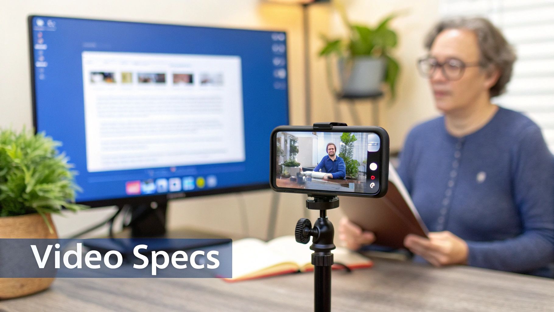
Uploading video natively, meaning directly to LinkedIn instead of linking to YouTube, is a huge advantage. The algorithm loves it. But first, you have to make sure your video file actually meets the platform’s strict rules.
Core Video File Requirements
Before you even think about aspect ratios or what to say in your video, your file itself has to pass the technical check. These specs are the non-negotiables for getting your video uploaded successfully.
Here are the hard limits you need to follow:
- Duration: Between 3 seconds and 10 minutes.
- File Size: No larger than 5 GB.
- File Format: LinkedIn accepts ASF, AVI, FLV, MOV, MPEG-1, MPEG-4, MKV, WebM, and MP4. That said, MP4 with H.264 video and AAC audio is your safest bet for compatibility and quality.
- Resolution: You can go up to a maximum of 4096x2304 pixels.
- Frame Rate: Keep it between 10 fps and 60 fps.
- Bitrate: Your range is 192 kbps to 30 Mbps.
Nailing these parameters from the start ensures your video processes without a hitch and looks sharp in the feed. This is the foundation for a good viewer experience.
Aspect Ratios and Dimensions That Work Best
The shape of your video, its aspect ratio, makes a massive difference in how it shows up on someone's screen. If you choose wisely, you can take up more space and stop people from scrolling right past your content.
Think about mobile viewing. A square video is incredibly effective because it fills more of the screen than a traditional widescreen video, making your post feel more prominent and harder to ignore.
Pro Tip: LinkedIn accepts a wide range of ratios from 1:2.4 to 2.4:1, but your best bets for engagement are 1:1 (square) and 9:16 (vertical). These are designed for a mobile-first world. Of course, the standard 16:9 (landscape) ratio still works perfectly fine, especially for people watching on a desktop.
Here are the recommended LinkedIn video dimensions and aspect ratios at a glance:
| Video Orientation | Dimensions (pixels) | Aspect Ratio | Best For |
|---|---|---|---|
| Square | 1080 x 1080 | 1:1 | Maximum feed presence, mobile and desktop |
| Vertical / portrait | 1080 x 1920 | 9:16 | Mobile-first, full-screen impact |
| Landscape | 1920 x 1080 | 16:9 | Desktop viewing, screen recordings |
| Maximum resolution | 4096 x 2304 | Up to 2.4:1 | Highest-quality uploads |
Yes, a 16:9 (1920x1080) video uploads fine on LinkedIn, so you do not have to reshoot horizontal footage. Just remember that square and vertical formats fill more of the mobile screen, where most LinkedIn viewing happens.
One more thing that's easy to overlook: always upload your video with captions. A huge portion of LinkedIn users watch videos with the sound off, so captions are essential for both accessibility and getting your message across. LinkedIn requires captions in the SubRip Subtitle (SRT) format, which you can attach during the upload process.
Don't just take my word for it. The data shows just how powerful video has become. Videos on LinkedIn now see an average engagement rate of 5.60%, a major jump from last year. This tells us that authentic, native videos really resonate. If you're interested in diving deeper, you can explore more LinkedIn performance benchmarks on Socialinsider.io. In the end, matching your video's dimensions to these high-performing formats is a strategic move you can't afford to skip.
Beyond the Feed: Mastering LinkedIn Articles and Polls
While standard posts are the bread and butter of your LinkedIn feed, don't overlook two of the platform's most powerful native features: Articles and Polls. Each serves a unique purpose, allowing you to diversify your content, showcase deep expertise, and genuinely interact with your audience.
Think of LinkedIn Articles as your own built-in blog. They are the perfect format for thought leadership, offering a dedicated space to explore complex topics far beyond the 3,000-character limit of a regular post.
LinkedIn Article Specifications
The first thing anyone sees is your article's cover image, so it needs to look sharp. This is your visual handshake, appearing both in the newsfeed and as a banner at the top of your article.
- Cover Image Dimensions: Stick to 1920 x 1080 pixels. This is a standard 16:9 aspect ratio, which guarantees your image will look great and won't get awkwardly cropped.
- Headline Length: While you have some flexibility, keep your headline under 100 characters. This helps prevent it from getting cut off in feed previews, ensuring your main idea gets across instantly.
Sparking Conversation with LinkedIn Polls
If you're looking for a quick and easy way to boost engagement, Polls are your best friend. They invite immediate interaction, encouraging your network to weigh in and share their opinions.
The setup is simple, but the character limits are tight:
- Question Length: You have up to 140 characters to pose your question.
- Option Length: Each answer option is limited to just 30 characters.
- Number of Options: You must provide at least two options but no more than four.
A smart poll does more than just drive up engagement numbers. It’s a fantastic tool for informal market research, giving you instant feedback straight from your professional community.
Mastering these formats is a key part of building effective social media strategies, ensuring all the effort you put into creating perfectly formatted content actually gets seen and appreciated.
LinkedIn Ad Sizes and Sponsored Content Specs
If you ever turn an organic post into a paid one, the size rules shift slightly. Sponsored content runs through LinkedIn Campaign Manager, and getting the ad dimensions right keeps your creative from being rejected or cropped at review.
The good news is that most ad formats reuse the same dimensions as your organic posts, so the design work carries over. Here are the key LinkedIn ad sizes you need:
| Ad Format | Recommended Dimensions | Aspect Ratio | Max File Size |
|---|---|---|---|
| Single Image Ad (landscape) | 1200 x 627 pixels | 1.91:1 | 5 MB |
| Single Image Ad (square) | 1200 x 1200 pixels | 1:1 | 5 MB |
| Carousel Ad Card | 1080 x 1080 pixels | 1:1 | 10 MB per card |
| Video Ad | 1920 x 1080 or 1080 x 1080 | 16:9 or 1:1 | 200 MB |
| Spotlight / Follower Ad Logo | 100 x 100 pixels | 1:1 | 2 MB |
A few quick rules for ad creative. Single image ads need a minimum width of 200 pixels. Carousel ads can hold 2 to 10 cards, and they perform best when every card uses the same 1:1 square format. Always use JPG or PNG for static ad images, and keep headline text short so nothing is cut off in smaller placements.
Your Top Questions About LinkedIn Post Specs, Answered
Even with all the specs laid out, you're bound to run into some specific questions. Maybe an image cropped weirdly on mobile, or you're wondering how the algorithm really feels about that link you're about to post. Let's tackle some of the most common questions that pop up.
Think of this as your quick-reference guide for those nagging little doubts that can make or break a post.
What Is the Best Image Size to Avoid Cropping?
The absolute safest bet to avoid any awkward cropping is to use a square 1:1 aspect ratio at 1080x1080 pixels. This format looks great and displays predictably on both desktop and mobile feeds. No surprises.
If you're designing with a mobile-first mindset, a vertical 4:5 ratio (1080x1350 pixels) is a fantastic choice. It takes up more screen real estate on phones and can really grab attention. Just know that it will get cropped slightly on the desktop view. For images that go along with a shared link, stick with the classic 1200x627 pixels (1.91:1 ratio).
Is LinkedIn 1200x1200 or 1080x1080?
Both square sizes work, and neither will be cropped. LinkedIn displays feed images at up to 1200 pixels wide, so 1200 x 1200 gives marginally sharper results on high-resolution screens, while 1080 x 1080 keeps your file size smaller and uploads faster. If you want one default to standardize on, 1080 x 1080 is the practical choice for most posts. Either way, stay at the 1:1 ratio and under 5 MB.
What Is the LinkedIn Post Size in cm or Inches?
Screen content is measured in pixels, not centimetres or inches, so always design to the pixel dimensions first. As a rough print-equivalent reference at 96 DPI, a 1080 x 1080 square works out to about 28.6 x 28.6 cm (11.25 x 11.25 inches), and a 1080 x 1350 vertical post is roughly 28.6 x 35.7 cm (11.25 x 14.06 inches). For anything you actually upload to LinkedIn, ignore the physical units and match the recommended pixel sizes.
How Many Pages Should My LinkedIn Carousel Have?
Technically, LinkedIn lets you upload a document with up to 300 pages. But let's be realistic, nobody is swiping through all that.
For peak engagement, you want to aim for the sweet spot: between 5 and 10 slides. That’s just enough space to tell a compelling story or break down a complex idea without your audience losing interest and scrolling past.
A quick pro-tip: Focus on making every single slide punchy and valuable. It’s far better to have a powerful 5-slide carousel than a rambling 20-pager. Quality always trumps quantity here.
Does LinkedIn Penalize Posts with External Links?
It’s true, the LinkedIn algorithm prefers to keep users on the platform. Because of this, posts that don't have any external links tend to get a bit more love from the algorithm, at least initially. This isn't just a rumor; it's a behavior content creators have consistently observed.
A popular workaround is to drop your link in the first comment right after you post. That said, don't be terrified of putting a link in the main post body. If your content is genuinely high-value and sparks immediate engagement (likes, shares, and especially comments), it can still perform incredibly well.
Should I Use PNG or JPEG for LinkedIn Posts?
The short answer: it depends on the type of image. For any graphic that contains text, logos, or clean lines, think infographics, quote cards, or branded templates, PNG is the way to go. It uses lossless compression, which means those crisp edges and sharp text stay intact without any fuzzy artefacts.
For photographs with lots of colour and detail, JPEG is your better bet. It offers an excellent balance between visual quality and file size, which helps your images load faster without looking noticeably worse. And when it comes to carousels, always export as PDF. It preserves fonts, keeps clickable links working, and delivers the most consistent quality across all slides.
What Is the Best Size Image for a LinkedIn Post?
The ideal size depends on your content type, but for a standard single-image post, go with 1080 x 1080 pixels (square) for universal compatibility or 1080 x 1350 pixels (vertical 4:5) if you want maximum screen impact on mobile devices. The vertical format is the tallest LinkedIn will display in the feed without cropping, making it a favourite for attention-grabbing visuals.
For link preview thumbnails, always use 1200 x 627 pixels to get a sharp, properly sized image when sharing URLs. And regardless of format, keep your image file under 5 MB to avoid upload errors. For a full breakdown of every dimension, our LinkedIn post size guide has you covered.
What Is the Best Format for LinkedIn Posts?
Different formats serve different purposes, and the best-performing content strategies use a healthy mix. That said, the data is clear: carousels (document posts) consistently pull in the highest engagement rates, averaging around 24%. Their slide-by-slide interactivity keeps people on your post longer, which the algorithm loves.
Native video is another heavy hitter, with engagement rates averaging 5.60%. It's perfect for showing personality, sharing expertise, or telling a story. Single image posts remain a reliable workhorse for quick tips, quotes, and announcements. And don't overlook text-only posts. They're fantastic for starting conversations and tend to generate the most comments per impression. For tips on getting the most out of each format, check out our guide to formatting LinkedIn posts.
What Are the LinkedIn Profile and Company Page Image Specs?
Your profile and company page visuals are your digital first impression. They're seen far more often than any individual post. Here are the key specs:
- Profile Picture: 400 x 400 pixels (1:1 square, displayed as a circle). Max 8 MB.
- Personal Cover Photo: 1584 x 396 pixels (4:1 ratio). Max 8 MB.
- Company Logo: 400 x 400 pixels (1:1 square). Max 4 MB.
- Company Cover Photo: 1128 x 191 pixels (roughly 6:1). Max 4 MB.
Keep your most important elements, logos, text, and CTAs, centred in your cover photos. LinkedIn crops them differently on mobile versus desktop, so anything near the edges risks being cut off. For a full walkthrough of all LinkedIn graphic types, see our LinkedIn graphic dimensions guide.
Ready to create perfectly formatted LinkedIn posts without the guesswork? Postiv AI combines a brand-trained AI writer with a carousel designer and scheduler to turn your ideas into authority-building content in minutes. Transform your LinkedIn strategy today at https://postiv.ai.