Great formatting on LinkedIn isn't just a nice-to-have; it's the single most important thing you can do to get your message seen in a sea of updates. Think about how you scroll through your own feed. You’re moving fast. A well-formatted post uses clean spacing, short paragraphs, and visual cues to make your content easy to read at a glance, especially on a phone.
This isn’t about making things pretty. It’s about making your insights accessible.
Why Formatting on LinkedIn Is Not Optional

Let's be blunt: on a platform as busy as LinkedIn, the look of your post is just as crucial as the content itself. A dense block of text is the digital equivalent of a brick wall. People see it, their eyes glaze over, and they keep scrolling without a second thought.
Good formatting, on the other hand, acts like a clear, well-lit path. It guides your reader from one point to the next, making it effortless for them to absorb your message. When a post feels inviting and scannable, professionals are far more likely to stop, read what you have to say, and actually engage with it.
The Psychology of a Well-Formatted Post
The most successful posts I've seen all follow a simple but powerful structure: Hook → Body → Call to Action (CTA). This isn't just a content formula; it's a framework built around how people actually read and process information online.
-
The Hook: Your first one to three lines are everything. This is your entire sales pitch to get someone to stop their scroll and click "...see more." It has to be magnetic, spark curiosity, or hit them with a bold claim they can't ignore.
-
The Body: Here's where you deliver the goods. The key is to break your main points into bite-sized paragraphs, often just a single sentence each. Strategic use of white space, bullet points, and even emojis creates a visual flow that pulls the reader down the page without causing mental fatigue.
-
The CTA: Every post needs a job to do. A clear, direct CTA tells your audience exactly what you want from them. Ask a question, invite them to share an opinion, or point them to a link. Give them a clear next step.
The difference this makes is staggering. Well-formatted posts can get up to 300% more engagement than plain, unformatted text. This massive lift happens because you're designing for the mobile experience—which is where over 70% of LinkedIn usage happens. You can dig deeper into the importance of LinkedIn formatting to see just how big an impact it has.
Core Formatting Principles at a Glance
Before we jump into the nitty-gritty of each technique, it helps to have a clear picture of the foundational elements. Think of these as the building blocks for every high-performing post you'll create from now on.
This table breaks down the essential principles we’ll be exploring in this guide.
| Formatting Element | Purpose | Impact on Engagement |
|---|---|---|
| Strong Hook | Grab attention in the first 210 characters before the "See More" cutoff. | Dramatically increases the click-through rate to your full post. |
| White Space | Create visual breaks to improve readability, especially on small screens. | Reduces reader fatigue and increases the total time spent on the post. |
| Short Paragraphs | Make complex ideas digestible and incredibly easy to scan. | Encourages people to read the entire post instead of just skimming. |
| Clear CTA | Guide the reader toward a specific action, like commenting or sharing. | Directly boosts comments, shares, and other key interaction metrics. |
Mastering these core ideas is the first and most important step. Formatting is just one piece of the puzzle — for the complete picture including scheduling, content types, and engagement tactics, check out our best practices for posting on LinkedIn. Want to see these formatting principles applied automatically? Our free LinkedIn post generator creates properly formatted posts with hooks, short paragraphs, and clear CTAs built in. Now let’s get into how to apply them.
Crafting Posts for Effortless Readability

It’s one thing to understand the theory, but actually putting it into practice is where you see the results. So, let’s get practical and build a post that people will genuinely stop and read. The secret isn't just in what you say, but how you say it—and that starts with a killer hook and the smart use of empty space.
Think about your own scrolling habits. You fly right past dense, intimidating walls of text. The goal here is to create a natural, inviting rhythm that pulls the reader in, especially on a small mobile screen where every pixel counts.
Nail the Hook Before the Fold
LinkedIn gives you about 210 characters before it hides your genius behind a "...see more" link. That tiny sliver of text is your entire sales pitch. Your first line has one job: earn that click.
Don't waste it on a generic opener. Lead with something that triggers an immediate question or feeling.
- Weak Hook: "I'm excited to share some insights about our recent project..."
- Strong Hook: "One conversation completely changed how I view project management."
See the difference? The first is forgettable corporate speak. The second one sparks real curiosity and promises a story—you can't help but wonder what was said. That’s how you get people to stop scrolling and start reading.
Embrace White Space and Short Lines
Huge paragraphs are the kryptonite of online reading. The absolute best way to structure the body of your post is with super short paragraphs, often just a single sentence, followed by a line break.
This technique creates a ton of white space, which guides the reader's eye down the page effortlessly.
It makes your post feel less like a formal article and more like a casual, easy-to-follow conversation. This isn't just a hunch; an analysis of 3,000 posts found that breaking up content every two or three lines is a common trait of top-performing content. Interestingly, that same study found that even longer posts (1,900-2,000 characters) can perform incredibly well, but only when they are meticulously structured and paired with great visuals. You can dig into more of these LinkedIn content trends on wavecnct.com.
Key Takeaway: The visual flow of your post is just as important as the words. Use white space as a tool to guide your reader and keep them from feeling overwhelmed.
Use Simple Symbols for Structure
You don't need fancy tools to organize your ideas. Simple emojis or symbols work perfectly as clean, effective bullet points that highlight key information or list out steps. They add just enough visual flair to break up the text without making it look messy.
I often turn to these when making a list:
- ✅ For benefits, features, or completed tasks.
- 👉 To point to a crucial piece of advice or a link.
- • A classic, professional-looking bullet.
- 💡 To highlight a fresh idea or a pro tip.
When you combine a powerful hook, plenty of white space, and these simple visual cues, you lay the foundation for a post that's not just easy to read, but a pleasure to engage with. Getting this right makes every other formatting trick you use that much more effective.
Adding Personality and Emphasis to Your Posts
Great formatting isn't just about making your posts easy to read; it's about making them memorable. Once you've nailed the basics of structure and spacing, you can start adding layers of emphasis and personality that help your content truly connect with your audience. It's the difference between a plain-text update and a piece of content that has real character.
The catch? LinkedIn doesn't have a built-in text editor for things like bold or italics. To pull this off, you'll need to use a Unicode text converter, which cleverly wraps your text in special characters that display as styled text on the platform.
Highlighting Key Points with Unicode Text
Using bolded text is a fantastic way to make a critical statistic, a powerful quote, or a key takeaway jump off the page. Italics can be great for adding a subtle shift in tone or for quoting someone.
But I have to give you a serious word of caution here: use this stuff sparingly.
Here’s why: Unicode text isn't actually standard text. Screen readers, which are essential for visually impaired users, often can't interpret these characters correctly. They might read them as a jumble of symbols or skip them entirely, making your content inaccessible. On top of that, there's a good chance LinkedIn's search algorithm won't index keywords wrapped in Unicode, which could tank your post's visibility.
My Personal Rule of Thumb: Only apply bold or italic formatting to words or short phrases that aren't critical keywords. Think of it as adding a little flavor, not highlighting the core message. If you want to try it out, a reliable LinkedIn bold text generator is a safe place to experiment.
Guiding the Eye with Emojis
Emojis are so much more than just little pictures. On LinkedIn, they're incredibly functional visual cues that help guide your reader's eye and communicate ideas in a split second.
Think of them as tools to:
- Replace boring bullets: A list using ✅, 👉, or 💡 is far more engaging than standard dashes or numbers.
- Set the tone instantly: A handshake (🤝) signals partnership, while a lightbulb (💡) immediately says "new idea."
- Draw attention to your CTA: An arrow emoji (➡️) pointing to a link is a simple but powerful way to tell people exactly what to do next.
The key is to keep it professional and relevant. A few well-chosen emojis can make your post more scannable and add a touch of warmth, but going overboard can quickly look unprofessional and cluttered.
Building Community with @Mentions
Tagging people or companies using an @mention is one of the best ways to expand your post’s reach while building genuine connections. When you mention someone, they get a notification, which makes them far more likely to comment or share—exposing your content to their entire network.
I find mentions work best when you:
- Give credit where it's due for an idea or quote.
- Tag a fellow expert to get their take on a topic.
- Thank a client or partner (with their permission, of course).
Just be sure to avoid "spam tagging"—the cringey practice of tagging a long list of people hoping to get their attention. Only tag people or companies that are directly relevant to your post. A genuine mention builds relationships; a spammy one burns them.
Formatting for Carousels and Multimedia Content
Let’s be honest, visuals are what stop the scroll on LinkedIn. But a great image or video without compelling text is a missed opportunity. Your copy shouldn't just describe what people are seeing; it needs to give them the why. It provides the context, the story, and the key takeaway that a picture alone can't.
Think of your text and visuals as a partnership. For an image post, the copy might share the surprising data point the graphic illustrates. For a video, the first few lines are your one shot to convince someone to stop, unmute, and actually watch. When they work together, they tell a much bigger, more memorable story.
Designing Compelling LinkedIn Carousels
When it comes to visual formats, document posts—what we all know and love as carousels—are in a league of their own. They’re incredibly effective because they turn a simple post into a bite-sized, interactive experience that keeps people swiping for more.
The engagement numbers are just staggering. Carousels on LinkedIn can generate 278% more engagement than videos and an incredible 596% more than a simple text post. Why? They tap directly into what the LinkedIn audience craves: valuable, easy-to-digest information.
To make a carousel that really performs, you need a solid narrative structure from start to finish.
- A Hook-Worthy Cover Slide: This is your post's headline, and it has to do the heavy lifting. Make it bold, clear, and promise real value. Think of it as the title of a mini-guide that people can't resist opening.
- A Clear Narrative Flow: Each slide needs to logically follow the one before it. Whether you're telling a story, breaking down a process into simple steps, or sharing a list of tips, keep it moving. Consistent design and plenty of white space are your best friends here—keep it clean and easy to scan.
- A Powerful Closing Slide: Don't just let your carousel fizzle out. The final slide is your call to action. Ask a question to spark conversation in the comments, encourage a follow for more tips, or just summarize the main takeaway. Give your reader a clear next step.
If you want a step-by-step walkthrough of the technical side, our guide on https://postiv.ai/blog/how-to-post-a-carousel-on-linkedin has you covered. Many of the best LinkedIn post creator tools now include built-in carousel designers that handle slide layout, branding, and PDF export so you never have to open a separate design app.
A great carousel feels like a mini-presentation. It should be so valuable that someone feels compelled to save it for later or share it with their team. Think checklists, quick-start guides, or myth-busting facts.
LinkedIn Post Format Engagement Comparison
Not all formats are created equal. The right choice depends entirely on your goal, and the data shows clear patterns in what resonates with the LinkedIn audience.
| Post Format | Typical Engagement Rate | Best Use Case |
|---|---|---|
| Document/Carousel | Very High (~6-8%) | In-depth guides, step-by-step tutorials, data storytelling, thought leadership |
| Image | High (~4-6%) | Announcing news, sharing quick tips, highlighting quotes, event promotion |
| Video | Moderate to High (~3-5%) | Behind-the-scenes content, expert interviews, product demos, personal stories |
| Text-Only | Moderate (~2-4%) | Asking questions, sharing personal anecdotes, starting conversations, quick takes |
This table illustrates that while carousels often lead the pack for deep engagement, other formats are essential for a well-rounded content strategy. The key is to match the format to the message you're trying to deliver for maximum impact.
Best Practices for Visuals
Whether you're building an epic carousel or just a single-image post, getting the technical specs right is non-negotiable for a professional look. For a comprehensive breakdown of every dimension and file limit, our LinkedIn post specs cheat sheet has everything in one place.
As a general rule of thumb, a square format (1200x1200 pixels) is a safe bet for both carousels and standalone images. It looks great and displays properly on both desktop and mobile feeds, so you don’t have to worry about awkward cropping.
The right formatting strategy brings your post to life, giving it a distinct personality.
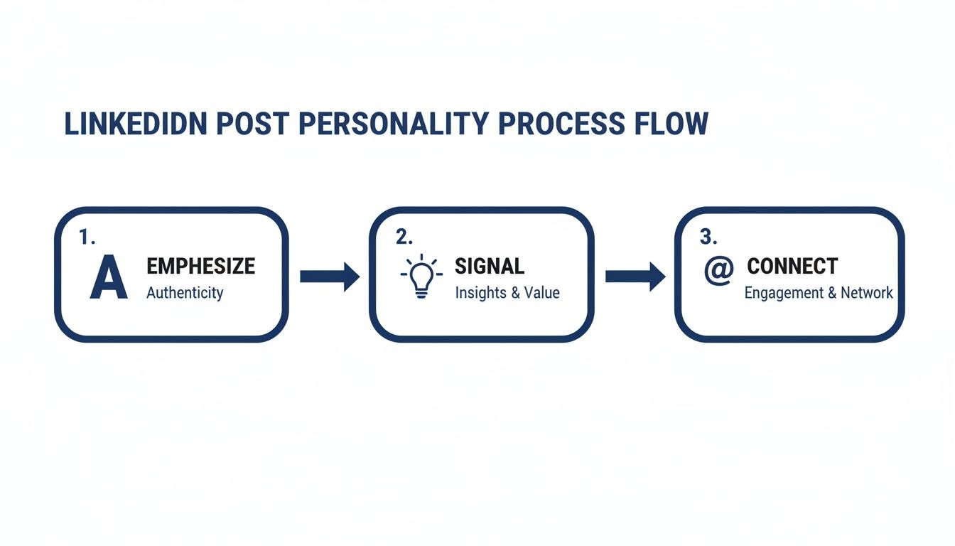
This simple flow is a great reminder that everything in your post—from the text to the visuals—should work together. You can emphasize authenticity with your story, signal key insights with visual cues, and connect directly with your audience through engagement prompts. It’s all part of a single, cohesive strategy.
Optimizing Your Posts with Hashtags and Timing
Getting the structure of your post right is a huge win, but two other elements can make or break its reach: your hashtags and your timing. If you get these right, you can take a solid post and make sure it lands in front of the right people when they're actually online and ready to engage.
Let's kill a common myth right away—more hashtags don't equal more views. In fact, stuffing your post with a dozen generic tags just looks desperate and makes your message less focused. A smarter, more targeted approach will get you much further.
Crafting a Modern Hashtag Strategy
So, what's the magic number? I've found that the sweet spot on LinkedIn is somewhere between three and five highly relevant hashtags. This isn't just a random number; a focused set of tags gives the algorithm clear signals about your content, helping it show your post to people who are genuinely interested in that topic.
The trick is to use a strategic mix. You want to cast a wide enough net but also be specific enough to attract the right kind of attention. Here’s a simple formula that works wonders:
- Broad Industry Tags (1-2): Think big. These are your high-traffic hashtags like
#Marketingor#ProjectManagementthat give you a chance at broad visibility. - Niche Topic Tags (1-2): Now, narrow it down. Instead of just
#Business, try something like#B2BLeadGeneration. These tags connect you with a smaller, but far more engaged, audience. - Branded or Campaign Tags (1): This one is all yours. A unique tag like
#YourCompanyNameor#YourAnnualEventhelps you track conversations specific to your brand and build a sense of community.
You might have seen people hide their hashtags or external links in the first comment to keep the post looking "clean." This was a popular trick for a while, but it's now outdated. LinkedIn’s algorithm wants to keep users on the platform, so it’s much better to place your hashtags directly at the end of your post copy.
Finding the Best Time to Post and Test
When you share your content is almost as critical as what you're sharing. You want to post when your target audience is scrolling, which gives your content the best shot at getting that crucial initial engagement. While there's plenty of general data out there, the absolute best time to post on LinkedIn is always going to be specific to your audience and your network.
Key Insight: Don’t just set a schedule and forget it. The real magic happens when you start testing. Your audience's behavior is the only data that truly matters.
This is where a little systematic testing goes a long way. Don't try to change everything at once. Instead, create a simple schedule to test one variable at a time. One week, test two different hooks. The next, try a different call to action. You can even experiment with post formats—text-only versus a carousel, for example—to see what drives the most likes, comments, and shares. This is how you stop guessing and start building a content strategy that actually works.
Common Questions About Formatting LinkedIn Posts
Even when you've got a solid plan, a few nagging questions always seem to pop up about LinkedIn formatting. It's easy to get tangled up in the details—character counts, the dreaded edit button, where to stick your hashtags. Getting these little things right can make a surprisingly big difference in how well your content performs.
Let's tackle some of the most common questions I hear.
What’s the Real Sweet Spot for LinkedIn Post Length?
LinkedIn gives you a massive 3,000-character playground, but that doesn't mean you should always use it. Honestly, there's no single "perfect" length. It all comes down to what you're trying to achieve with your post.
If you're aiming for a deep, thought-provoking piece, I've found that posts in the 1,900-2,000 character range tend to get the best traction. That gives you enough room to really unpack an idea and offer serious value. On the flip side, a short, punchy post of around 150-300 characters can work wonders, especially when it’s paired with a strong visual like a great photo or a carousel.
No matter how long your post is, the most critical part is the hook. Your audience only sees the first 210 characters before they have to click "...see more," so you absolutely have to make those first few lines irresistible.
Does Editing a Post After Publishing Kill Its Reach?
This is a big one, and the short answer is yes, it can. When you hit "post," the LinkedIn algorithm gives your content a little boost to see how people react. If you jump in and edit it right away, especially within the first hour or two, you can disrupt that initial momentum. It's almost like hitting a reset button on its distribution.
My best advice? Proofread everything before it goes live. I always draft my posts in a separate app or use a LinkedIn post formatting tool to catch mistakes beforehand. If you absolutely have to make a change, do it fast, but just know you might be sacrificing some of that initial reach.
Hashtags: In the Post or in the First Comment?
Ah, the great hashtag debate. For a while, everyone was hiding their hashtags (and links) in the first comment to keep the post looking clean. But those days are over. LinkedIn has been very clear about this: for maximum discoverability, put your hashtags right in the post.
The algorithm is designed to help users find relevant content. When you include 3-5 highly relevant hashtags at the end of your post, you're helping LinkedIn properly categorize and show your content to the right people. It’s the official best practice now, and it’s how you get your posts to show up in topic feeds and searches.
Ready to stop guessing and start creating high-impact LinkedIn content in minutes? Postiv AI combines a brand-trained AI writer, carousel designer, and scheduler into one seamless workflow. Turn your ideas into authority-building posts that get noticed. Start your free trial at Postiv AI.