

A useful LinkedIn carousel idea starts with something you can show: a decision you made, a process you use, a mistake you can explain, or a question your customers keep asking.
“Marketing tips” leaves you with a blank deck. “How I decide which customer interview quotes belong on a landing page” gives you an audience, a problem, and material for the slides.
Below are nine approaches drawn from real public posts in Postiv’s inspiration library. Each includes a browsable preview of three original slides, the source, its recorded engagement, the slide progression, and original angles for founders, consultants, and marketers. Choose the one you have the evidence to make your own.
Pick an idea from the material you already have
| What you have | Start with this carousel idea | What the reader gets |
|---|---|---|
| A problem you diagnose repeatedly | 1. A self-check | A way to spot what needs fixing |
| Examples of weak and strong work | 2. A quality comparison | A standard they can apply |
| A process you can demonstrate | 3. A walkthrough | Steps toward a concrete result |
| Habits you have learned to question | 4. A behavior comparison | A better choice in a familiar situation |
| A frustration your peers recognize | 5. An industry observation | Recognition and a conversation worth joining |
| A decision that taught you something | 6. A lesson from experience | Judgment they can borrow |
| Resources you know well | 7. A toolkit organized by task | Help choosing what to use |
| Outputs from something you tested | 8. A test with a verdict | Evidence for a purchase or workflow decision |
| Research relevant to your audience | 9. A report interpretation | An explanation of what the findings change |
If you are stuck, start with a question from your last customer conversation. Write down your answer and the example you used to explain it. That is enough material to explore a self-check or a walkthrough.
Have notes but no clear angle? Work through them with Bob in Postiv: bring your audience and source material, then ask for three angles and the evidence each needs.
For visual inspiration, browse our LinkedIn carousel examples. Once you have chosen the idea, our carousel templates guide helps you arrange it into a reusable structure.
How to read the examples and numbers
We reviewed the library on 27 September 2026, inspecting original PDFs where available and archived slide previews plus extracted outlines elsewhere. The counts below are historical values stored in the library. Most records do not retain the exact engagement capture time; Helen Yu’s example has a matching dated snapshot.
These are raw engagement counts, without an adjustment for audience size. They do not tell us saves, impressions, leads, or which slide caused a response. The explanations of why an execution may help are editorial analysis. The adaptation hooks are our original suggestions: use a first-person claim only when it matches your experience.
1. Turn a recurring problem into a self-check
Real post: Nikolett Jaksa’s offer clarity carousel (23 February 2026). Recorded: 255 likes and 206 comments.
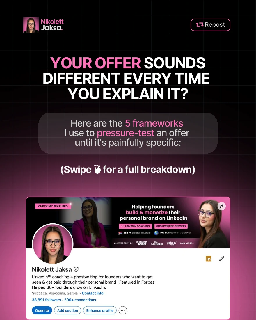
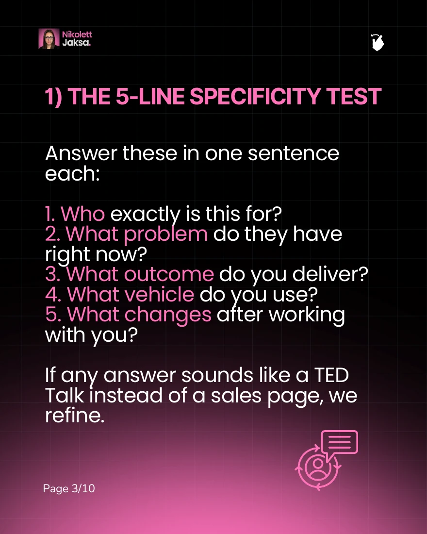
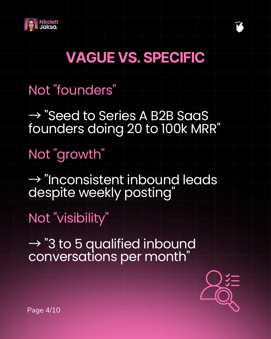
Her opening asks, “Your offer sounds different every time you explain it?” That makes the idea easy for a service provider to recognize in their own work.
The 10-slide PDF moves from the symptom to a common evasive answer, then introduces five ways to test an offer. It includes a concrete comparison of vague and specific positioning, checks whether another consultant could use the same description, and ends by inviting readers to bring their own unclear line into the comments.
What to learn: A self-check gives readers a task they can complete while reading. The examples show what a useful answer looks like. This fits consultants, coaches, and founders whose customers struggle to name the problem they solve.
Make it yours: Use the questions you actually ask during discovery or review. Include a worked answer, explain what a weak answer reveals, and finish with the next decision.
- Founder: “Can a first-time visitor explain what your product does?”
- Consultant: “The questions I ask before scoping a project.”
- Marketer: “Is your campaign brief ready for a writer?”
Bring one real brief, offer, or page you can discuss publicly. A checklist becomes useful when the reader can see how you apply it.
2. Show what better actually looks like
Real post: Chris Donnelly’s AI prompt comparison (9 January 2026). Recorded: 1,728 likes, 562 comments, and 180 shares.
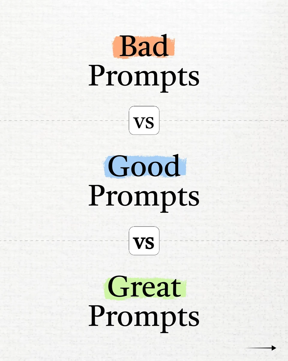
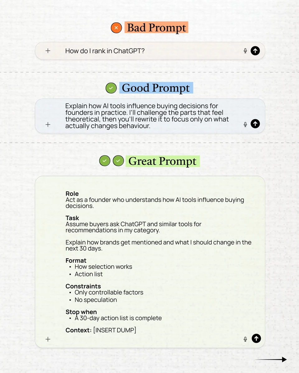
The cover promises “Bad Prompts vs Good Prompts vs Great Prompts.” Across the nine-slide deck, the comparisons cover tasks such as writing a post, researching a market, and developing a business strategy. The inspected middle slide makes the progression visible: the most detailed version specifies the role, task, output, constraints, and context.
What to learn: Readers can compare versions of the same task. That gives substance to advice such as “be more specific.” The pattern suits anyone whose expertise includes evaluating writing, design, proposals, briefs, or processes.
Make it yours: Hold the task constant. Show the original, your revision, and a stronger version with a short explanation of the important change. For the first attempt, one well-explained comparison is enough.
- Founder: “Three ways to explain the same feature.”
- Consultant: “From vague scope to a proposal a buyer can evaluate.”
- Marketer: “Generic, specific, useful: rewriting one email opening.”
Use your own work or label an invented example as illustrative. Clearer wording alone does not establish a conversion lift; only claim a lift if you measured it.
3. Walk through one useful task
Real post: Ruben Hassid’s research-agent tutorial (29 December 2025). Recorded: 1,115 likes, 311 comments, and 106 shares.

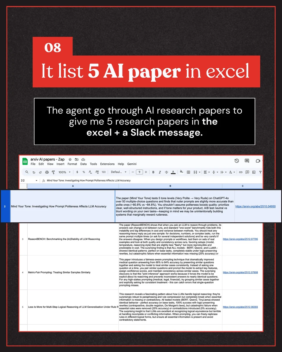
The cover claims “This boring AI agent gives me back 600 mins/month.” That is the creator’s time-saving claim; we have not independently verified it.
The archived outline for the 12-slide deck covers opening Zapier, creating an agent, describing the research task, selecting tools, testing, and activation. A preserved result slide shows a spreadsheet of research papers and describes a Slack message. The deck closes with a sharing request.
What to learn: The promise is a specific job completed. Showing the output helps readers understand what they are building before they invest time in the instructions. This fits product education and repeatable professional workflows.
Make it yours: Choose a task you can run today. Capture the input, the meaningful steps, and the output. Include the step where a beginner is most likely to need help.
- Founder: “How a new customer reaches their first useful result.”
- Consultant: “How I turn interview notes into a decision memo.”
- Marketer: “How I turn one webinar question into several useful posts.”
A behind-the-scenes process or product feature can use this approach too. Demonstrate the job the feature helps someone do, with current screenshots and any prerequisites.
4. Contrast looking busy with making progress
Real post: George Stern’s busy-versus-effective carousel (5 November 2025). Recorded: 3,755 likes, 381 comments, and 685 shares.
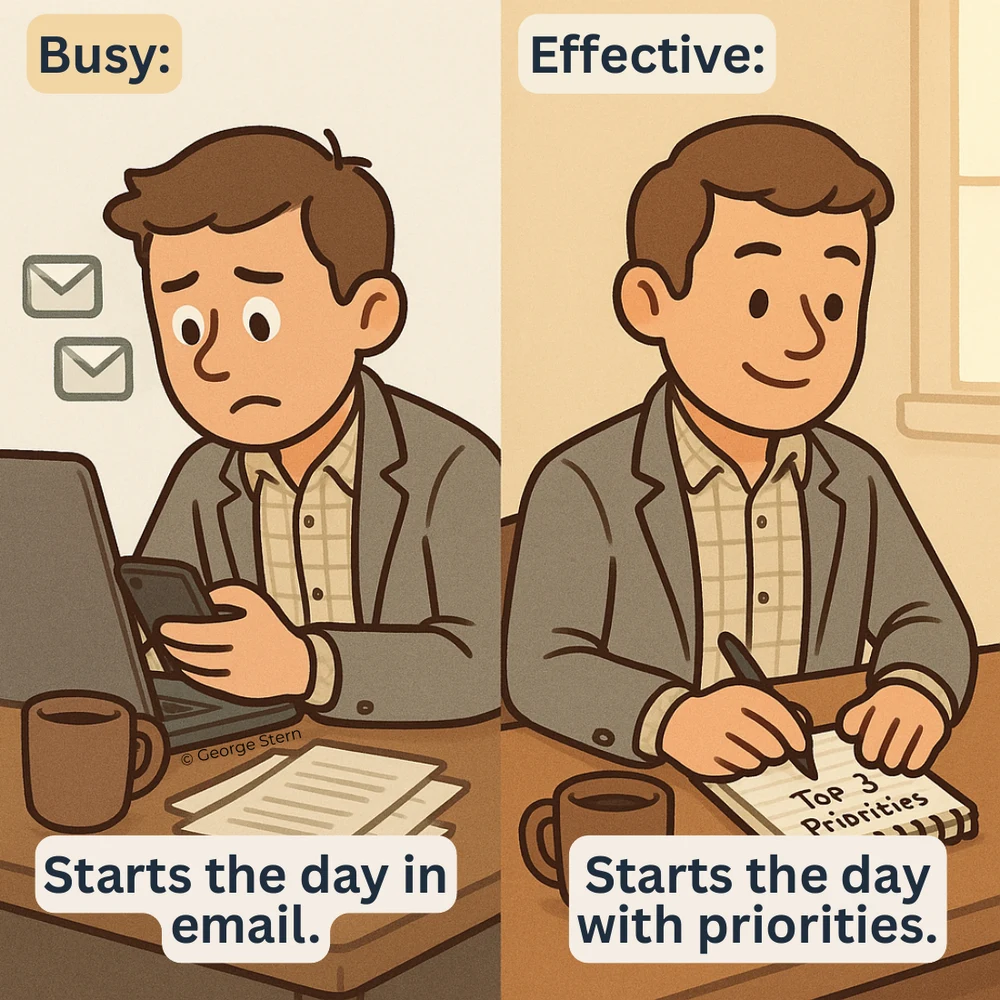
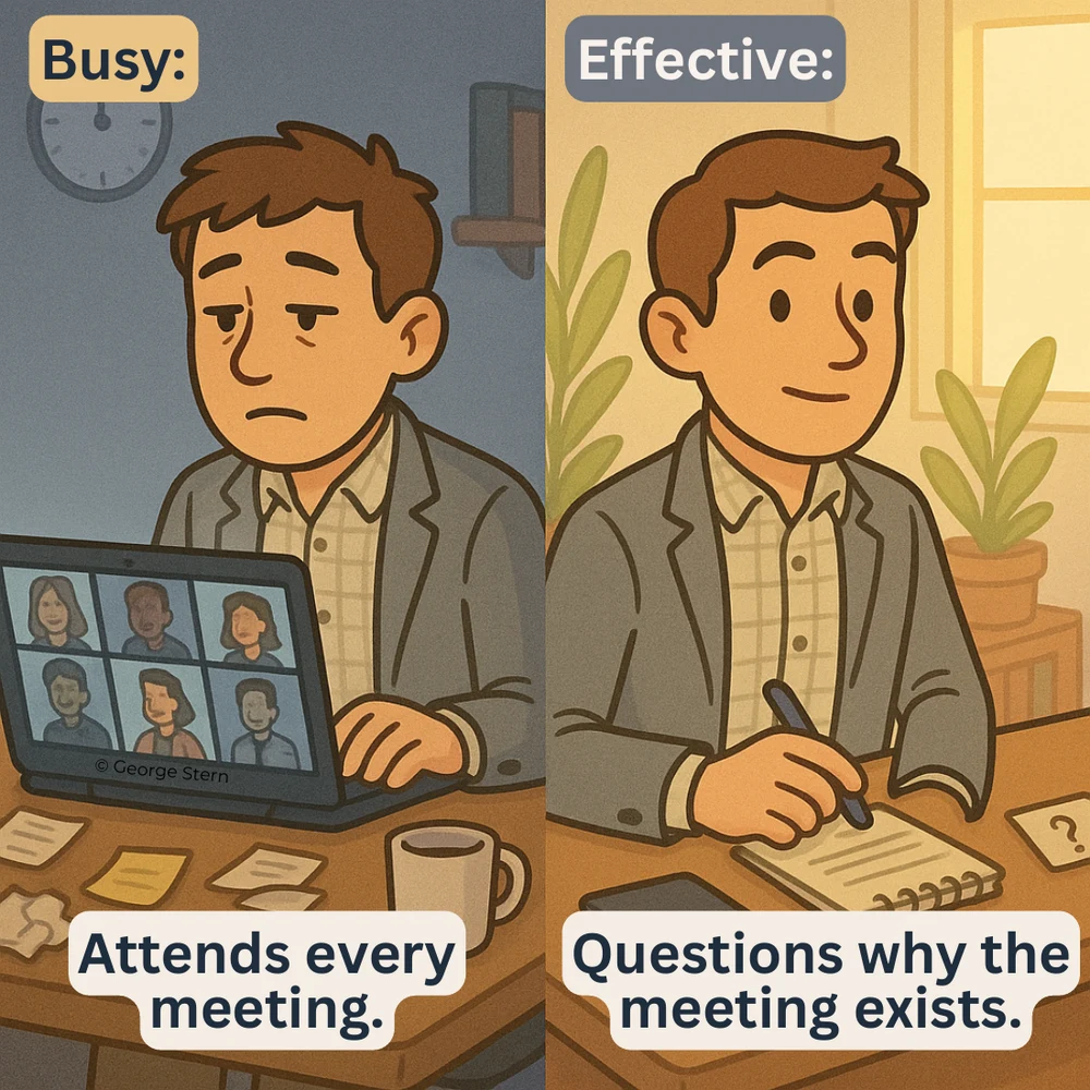
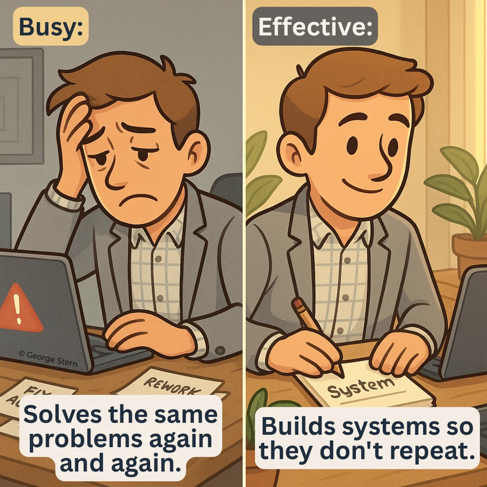
The first slide immediately compares starting the day in email with starting from priorities. Eight paired behaviors cover recovery, meetings, preparation, recurring problems, calendar space, priorities, and delegation. A takeaway and a question about which change to try complete the 10-page PDF.
What to learn: The first page delivers the comparison. The repeated two-column structure makes each later example easy to understand. The idea fits operators, managers, and advisers who can identify a familiar habit and offer a practical replacement.
Make it yours: Choose one role and one situation. Explain what the replacement helps someone accomplish and when the original behavior may still be necessary.
- Founder: “Tasks I stopped doing once we had a product to support.”
- Consultant: “Busy delivery vs useful client progress.”
- Marketer: “A full content calendar vs a clear campaign.”
For example, compare adding another status meeting with writing down a decision and its owner. Tie the advice to your actual working conditions so it does not become a list of universal rules.
5. Put a shared frustration into words
Real post: Aneta Kmiecik’s designers-and-AI carousel (4 May 2026). Recorded: 3,169 likes and 312 comments.
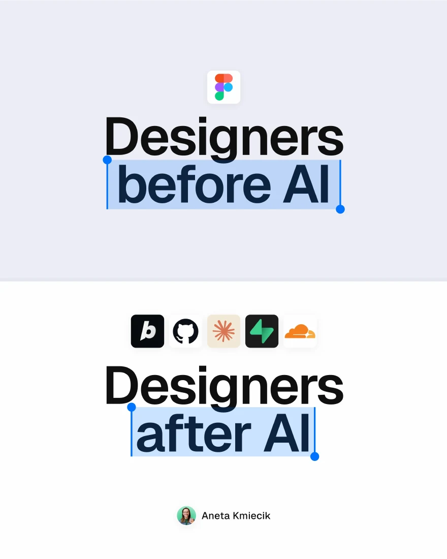
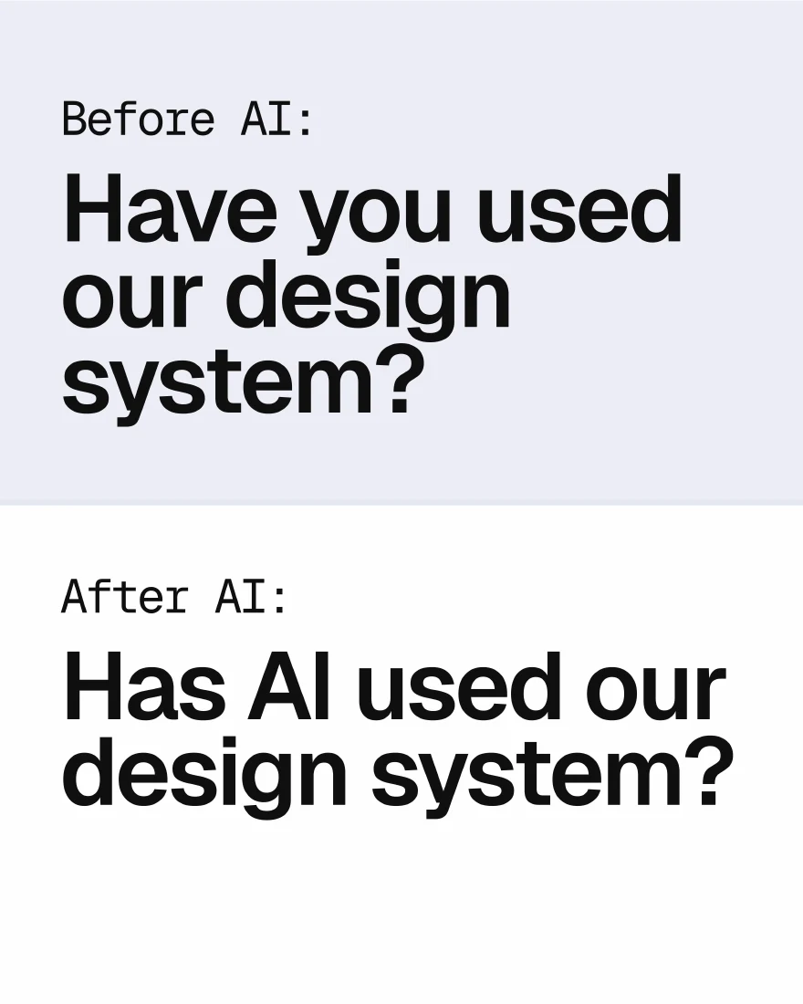
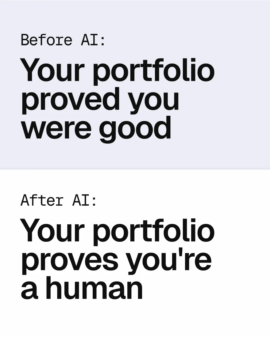
The cover contrasts designers before and after AI. The 12-slide PDF turns that comparison into recognizable situations: a growing list of required tools, product managers arriving with their own design directions, more button variants, and the shift from running out of ideas to running out of credits. It ends by asking readers to add funny examples.
What to learn: The humor depends on details a particular audience knows. The repeated comparison gives readers a clear way to contribute another observation. This suits personal-brand and community content when you understand the work from the inside.
Make it yours: Collect situations you have experienced or heard repeatedly from peers. Keep the joke aimed at the situation and give the reader an easy way to add their own version.
- Founder: “What I thought product launches involved.”
- Consultant: “What ‘a quick revision’ looks like from both sides.”
- Marketer: “Marketing before and after everyone got AI.”
A broad joke about meetings could come from anyone. A precise observation about the moment a review meeting creates three conflicting briefs shows familiarity with the job. For more conversation-led angles, see our engagement post ideas.
6. Teach the lesson behind a real decision
Real post: Noah Kagan’s entrepreneurship lessons (20 July 2024). Recorded: 610 likes, 76 comments, and 24 shares.
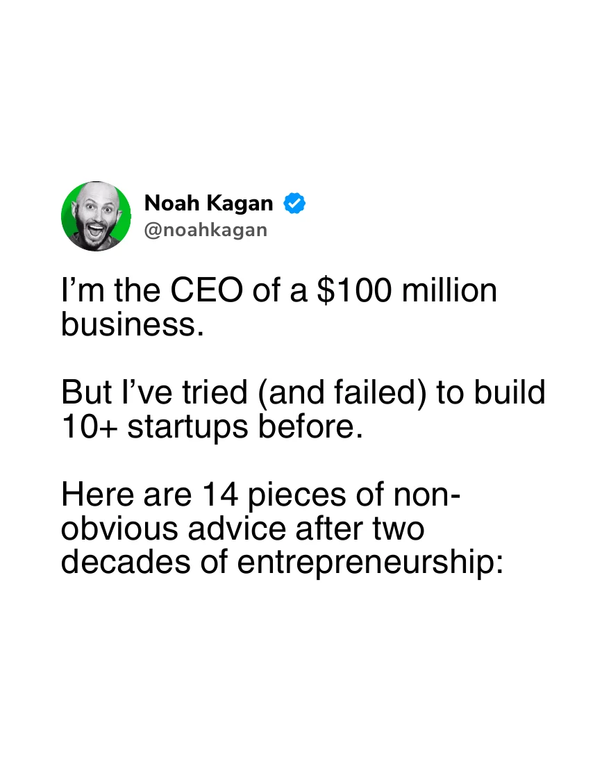
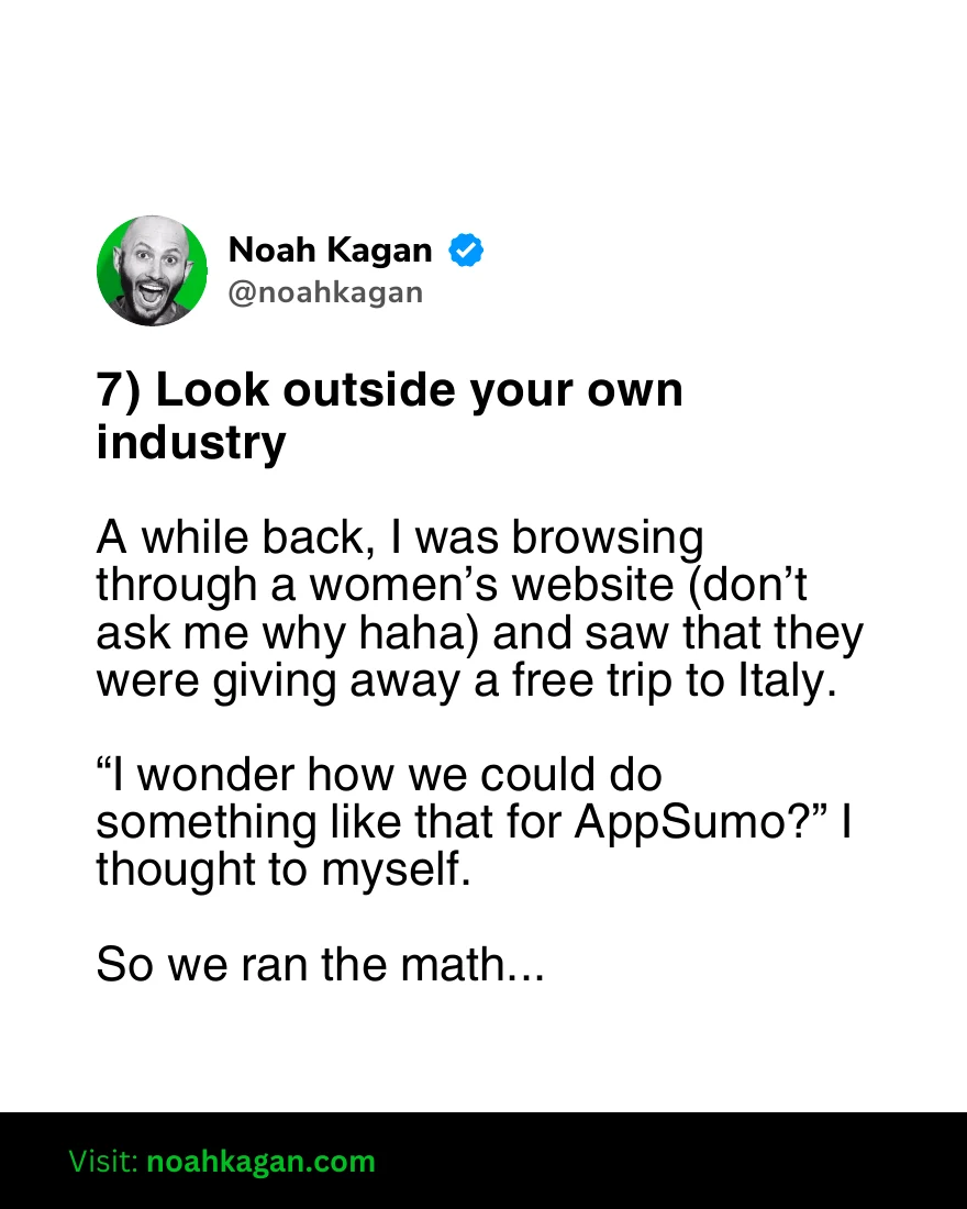
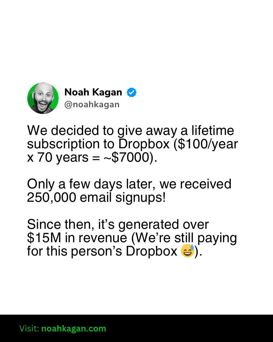
The opening connects 14 lessons to the creator’s business experience, including failed attempts. The 29-page PDF alternates advice with the incidents or explanations behind it: finding overlooked marketing opportunities, turning an internal solution into a product, involving customers while building, and developing distribution. It ends with an invitation to his newsletter.
What to learn: Several lessons receive more than one page. A reader gets the circumstances behind the advice. This is useful for founders and practitioners whose experience contains decisions someone else will soon face.
Make it yours: Start with one decision. Describe what you believed, what happened, what changed your mind, and the rule you now use. Your first carousel does not need 14 lessons or a major revenue milestone.
- Founder: “The decision I would change in our first launch.”
- Consultant: “What my first difficult handover taught me.”
- Marketer: “What a campaign that missed its target changed about our brief.”
A client case study can follow the same progression. Use permissioned evidence, define the starting point and timeframe, and separate observed results from your explanation of what caused them.
7. Organize resources around the job to be done
Real post: Akhil Yash Tiwari’s product-management toolkit (22 December 2025). Recorded: 339 likes, 14 comments, and 33 shares.
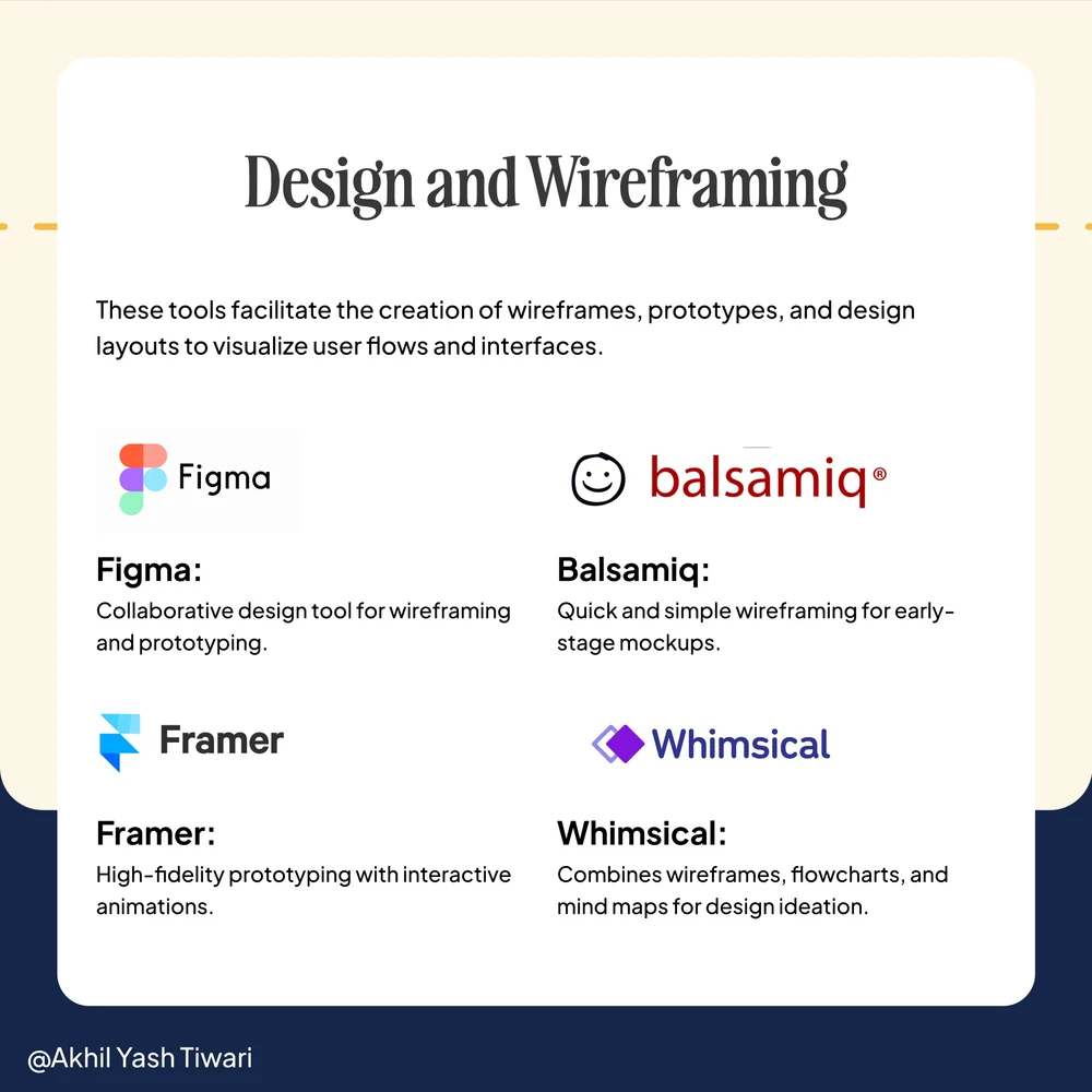
The cover addresses product managers directly. The archived outline for the 11-slide deck groups tools by work: roadmapping, analytics, design, task management, customer feedback, and collaboration. It then gives selection criteria and asks readers about their preferences. The preserved design slide pairs named tools with a short description of their purpose.
What to learn: Categories help a beginner locate a gap in their workflow. Brief explanations make the list more useful than a collection of logos. This fits advisers or practitioners who regularly help others select resources.
Make it yours: List the jobs first, then the resources you know well. Add a reason to choose each one, a limitation, and the point at which someone may need something else.
- Founder: “One tool for each job in our customer feedback workflow.”
- Consultant: “My minimum setup for a research engagement.”
- Marketer: “The resources I use before writing a campaign.”
Books, questions, templates, and checklists can fill these slots too. If you have not used a resource, describe it as a researched option and explain what you checked.
8. Show a test and explain your verdict
Real post: Audrey Chia’s image-generation walkthrough (2 January 2026). Recorded: 248 likes, 111 comments, and 12 shares.

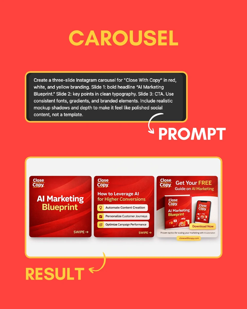

The archived outline for the 11-slide deck introduces a specific image-model release, compares versions, explains the workflow, and shows outputs for marketing tasks. A preserved carousel slide places an input prompt alongside its visual result. The outline ends with a qualified verdict about ideation versus production readiness, followed by a follow invitation.
What to learn: The audience can inspect an output before reading the judgment. The qualified conclusion is a useful part of the pattern. This fits marketers and consultants whose audience needs to decide whether an approach is ready for real work. This historical example is not a review of the current product.
Make it yours: Define the job and evaluation criteria before testing. Show what you supplied, what came back, what you changed, and what you would use it for.
- Founder: “Can this workflow handle a messy customer request?”
- Consultant: “I compared two ways to turn a workshop into an action plan.”
- Marketer: “Which version of this creative is ready to show a client?”
For a fair comparison, keep the input and task consistent. Include unsuccessful outputs when they explain the verdict. A small qualitative test can be useful without pretending to establish a universal winner.
9. Turn a report into a decision for your audience
Real post: Helen Yu’s post sharing NVIDIA’s financial-services AI report (24 July 2026). Recorded on 31 July 2026: 465 likes and 199 comments.
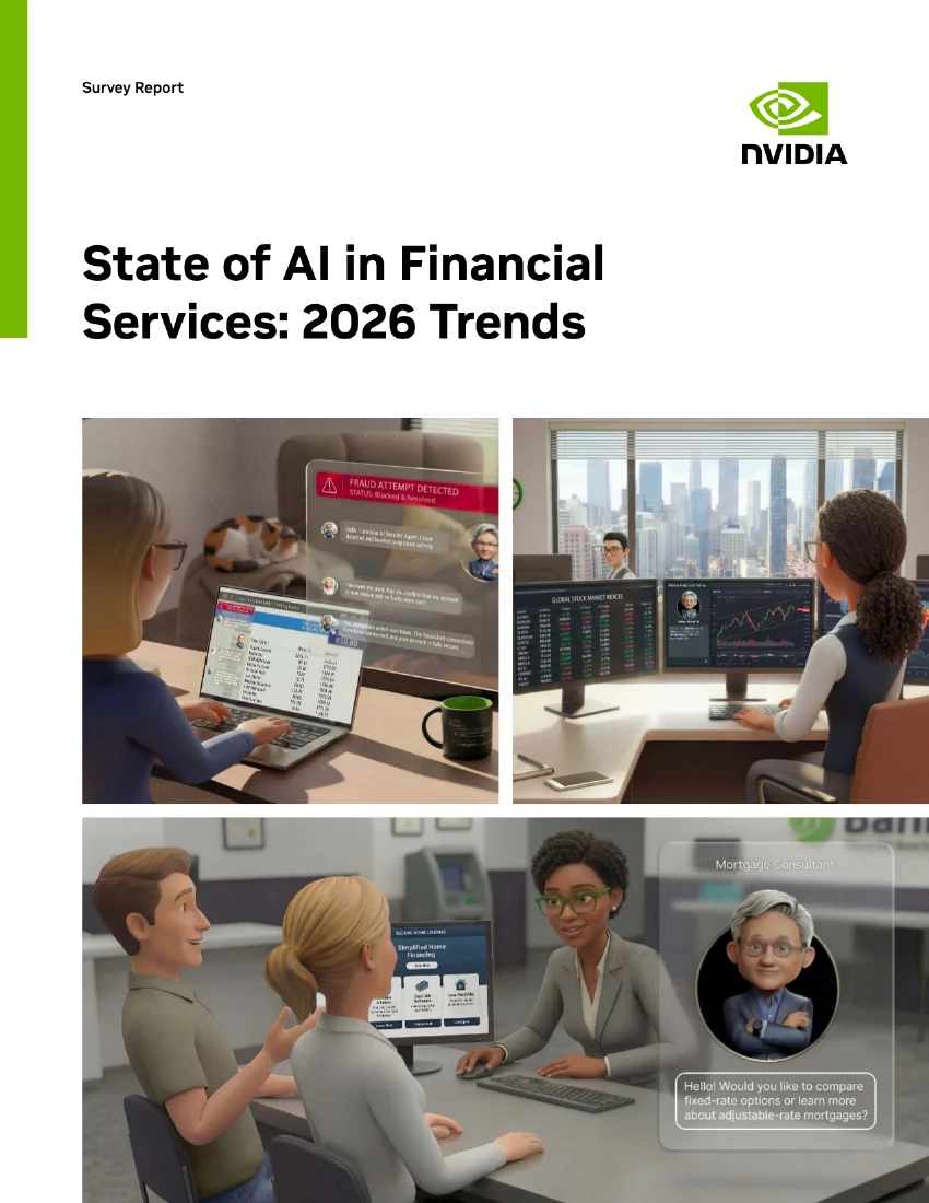
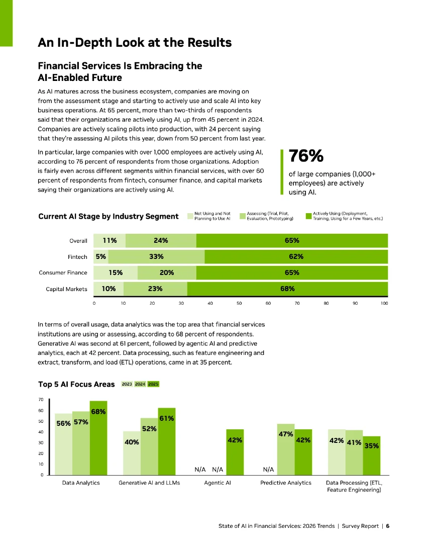
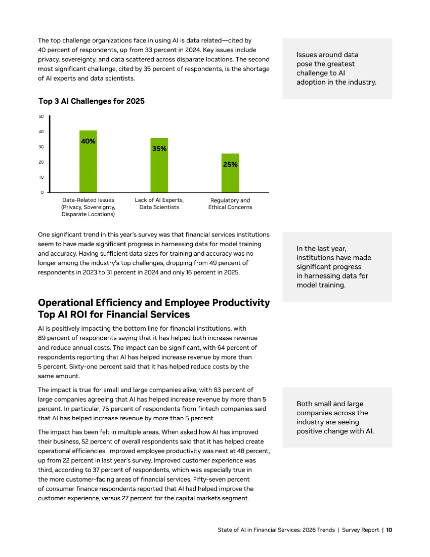
The attached document is NVIDIA’s 14-page survey report. Its progression moves from an overview and executive summary into adoption, uses, challenges, business impact, investment, and methodology. Helen’s caption selects findings and frames the shift toward implementation.
What to learn: The source document supplies context around the numbers, while the caption gives the audience a reason to look. This fits specialists who can explain what industry research means for a particular decision.
Make it yours: Pick one finding relevant to your readers. Explain who was studied, when, what the finding says, what it leaves uncertain, and what you would do next. A shorter interpretation should add your judgment and link to the original report.
- Founder: “What this industry survey changes about our roadmap.”
- Consultant: “The questions a board should ask after reading this report.”
- Marketer: “The finding we would test before changing our campaign.”
Keep the survey population and timeframe attached to any statistic. If you have your own research or experiment, state the sample and method, including limitations. A number becomes useful when the reader understands what decision it can support.
Turn your chosen idea into a slide outline
Before designing, finish this sentence:
I help [specific audience] make [one decision], using [experience or evidence I can show].
Then list the material you have: an example, screenshot, checklist, source, or observation. If you cannot fill that list yet, gather the material before making the hook more ambitious.
Here is an original illustrative outline for a consultant with a project-kickoff checklist. It describes a method, not a reported client result:
- Promise: “A kickoff is not finished until these three decisions are written down.”
- Problem: A task list can look complete while nobody agrees on the outcome, approval owner, or first milestone.
- Decision one: What must be different when the work is done? Show how you replace a vague aim with an observable deliverable.
- Decision two: Who can approve that deliverable? Show the field you use to name the decision-maker.
- Decision three: What happens first, and by when? Show one clearly assigned milestone.
- Worked example: Put those three answers together in a short, explicitly illustrative kickoff note. Explain where the method needs adapting.
- Next step: Invite readers to check those three answers before their next kickoff.
Replace the method and examples with your own. The useful work is deciding what the audience should understand after each slide. Our LinkedIn carousel templates can help with the layout once that sequence is clear.
A brief you can use with Postiv
Postiv lets you search its inspiration library and develop a carousel through a conversation with Bob. Bring your audience, expertise, and source material into that conversation so the angle has something specific to build on.
Start with this brief:
I help [audience] with [problem]. Here are three questions they ask: [questions]. Here is material I can use: [notes, examples, or sources]. Find relevant carousel inspiration and suggest three distinct angles. For each, explain the reader’s takeaway, why it fits my expertise, and what evidence is missing. Ask me about the gaps before writing the slides.
Choose the angle you can support, then continue:
Develop angle [number] into a carousel. Use my examples and the writing sample below to match my voice. Show the slide outline first. Label illustrative examples clearly, attribute outside sources, and flag any claim that needs verification. After I review the outline, create the slides using my saved profile branding.
Open Postiv and work on your carousel idea. If you already have the angle and outline, explore the LinkedIn carousel generator. If you are still choosing a production tool, our carousel maker comparison covers that decision.
FAQ
What should I put in a LinkedIn carousel?
Choose one problem your audience recognizes and show a useful way to understand or solve it. A self-check, worked comparison, walkthrough, lesson, resource guide, test, or research interpretation can all work. Include examples or evidence, and give the reader a clear next step.
How many slides should a LinkedIn carousel have?
Use enough slides to deliver the idea clearly. The source documents in this guide range from nine to 29 pages, so they do not establish one ideal length. For a first draft, six to ten slides is a manageable editorial starting point. Add or remove slides according to what the explanation needs.
Do LinkedIn carousels still work in 2026?
The 2026 posts in this guide have recorded engagement, but this selected sample cannot show that carousels outperform other formats or generate sales. Try an idea that suits your audience, compare it with your own usual results, and track the responses that matter to your goal, such as relevant questions or qualified inquiries.
How do I come up with LinkedIn carousel ideas consistently?
Keep a note of customer questions, recurring mistakes, decisions, and examples from your work. For each, record who it helps and what you can show. Choose a format after you have that material. A useful question with a concrete answer is a stronger starting point than an empty slide template.
Can I adapt someone else's carousel idea?
Use the underlying approach, such as a self-check or comparison, and develop it with your own evidence, wording, and point of view. Credit a creator when discussing their example or using a distinctive framework. Keep their business results attached to them; never present them as your own.