If you want to understand how your content is really performing, you can't just start by looking at a dashboard. You have to begin with the end in mind. That means tying every piece of content you create back to a specific business objective and then picking the right Key Performance Indicators (KPIs) to see if you're hitting the mark.
This simple shift in perspective moves you from chasing empty numbers like likes and shares to focusing on data that actually tells you if your content is making an impact. It's all about defining what a "win" looks like for your business—is it more leads? A stronger brand reputation? More sales?—and then setting up your analytics to track those specific outcomes.
Setting the Stage for Meaningful Content Analysis
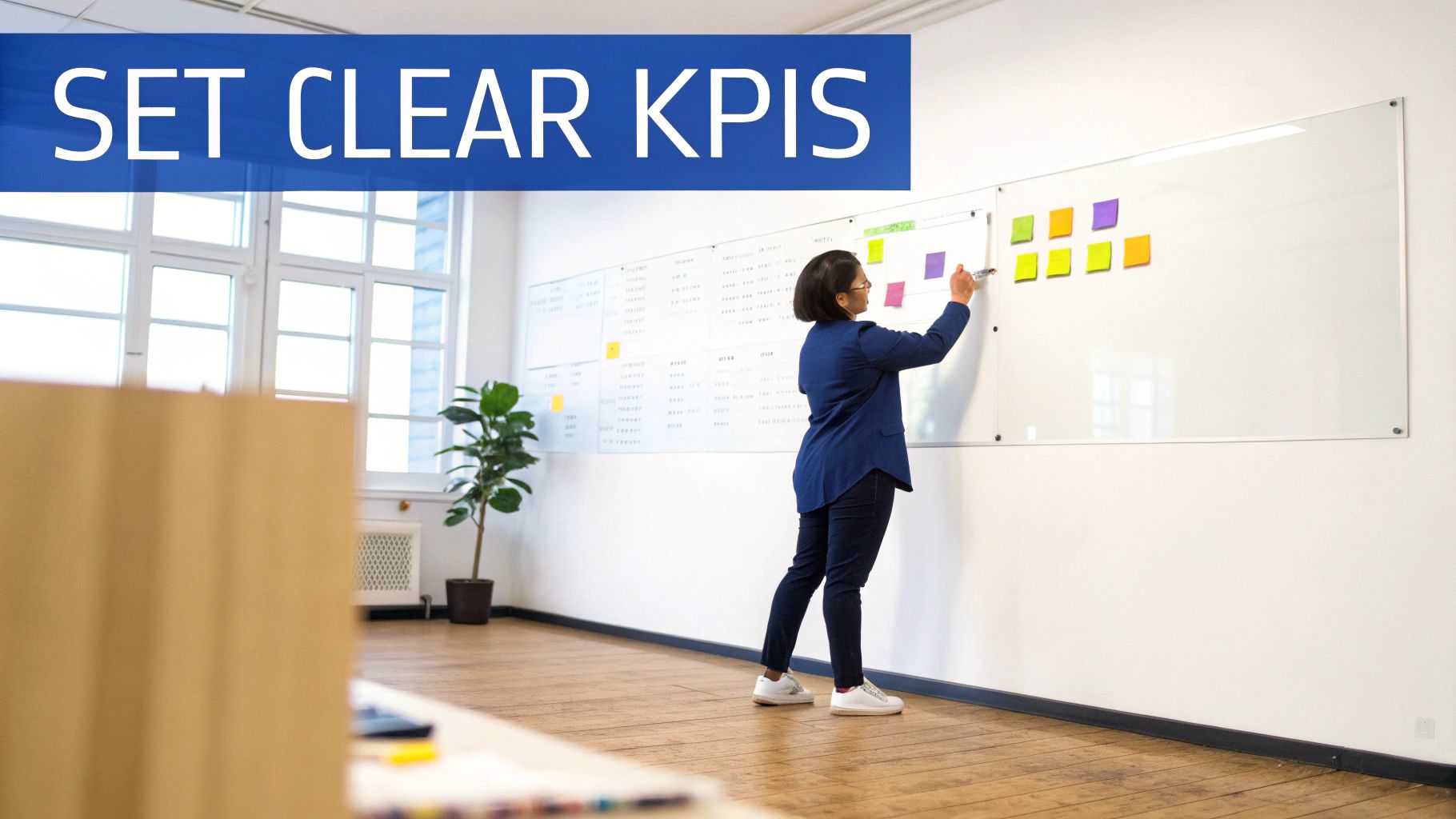
Before you even think about looking at a single metric, you need to ask one fundamental question: "What is this content supposed to do for the business?" Without a clear answer, you're just tracking numbers in a vacuum. I've seen it happen a thousand times—people get caught up in tracking every impression, but effective analysis is about measuring progress against a real goal.
Getting this alignment right from the start helps you avoid the classic trap of chasing vanity metrics. You know the ones—the numbers that look great on a report but don't actually move the needle for your business. For example, a LinkedIn post that gets 10,000 views sounds like a huge success. But if your goal was to generate demo requests and it got zero, it was a failure.
Connecting Business Goals to Content KPIs
Think of every article, video, or post as an employee with a specific job. Your task is to define that job and figure out how to measure its performance. This is where you translate those big-picture business objectives into tangible, trackable content metrics.
Let's say your overarching goal is to boost inbound leads by 20% this quarter. Your content strategy might focus on publishing in-depth articles that drive people to download a new ebook.
In that scenario, your key KPIs wouldn't be page views. They would be:
- Form Submissions: How many people actually downloaded the ebook after reading your content?
- New Contacts: How many of those downloads were from brand new leads?
- Conversion Rate: What percentage of people who saw the content took the desired action?
It’s this direct line of sight from business goal to content KPI that gives your analysis real teeth.
A key mistake many creators make is treating all metrics equally. A comment from a target C-suite executive is infinitely more valuable than 100 likes from an irrelevant audience. Context is everything when you analyze content performance.
A Practical Guide: Connecting Business Goals to LinkedIn Content KPIs
To make this crystal clear, here’s how you can translate common business objectives into specific KPIs for your LinkedIn content. This framework ensures you're always tracking what matters.
| Business Goal | Primary Content Metric (KPI) | Example Insight to Track |
|---|---|---|
| Increase Brand Awareness | Impressions & Follower Growth | "Are our posts reaching new audiences in our target industries?" |
| Generate MQLs | CTR on Gated Content Links | "Which post formats drive the most clicks to our lead magnet landing page?" |
| Build Thought Leadership | Comments from Relevant Professionals | "Are industry leaders and potential buyers engaging in meaningful conversations on our posts?" |
| Drive Website Traffic | Outbound Clicks | "How many users are clicking through from our LinkedIn content to key pages on our website?" |
| Recruit Top Talent | Clicks on 'Careers' Link in Bio | "Did our company culture post lead to a spike in traffic to our careers page?" |
Using a simple table like this can keep your team focused on measuring the right things, turning vague goals into a clear, actionable measurement plan.
Distinguishing Actionable Metrics from Vanity Metrics
Once your goals are locked in, it becomes much easier to separate the signal from the noise. Vanity metrics make you feel good; actionable metrics help you make better decisions. On a platform like LinkedIn, this distinction is critical.
Imagine a LinkedIn post gets 500 likes and 50 comments. Those are classic vanity metrics. They show people are engaging, but they don't tell you if the right people engaged or if they took a meaningful next step.
Now, let's look at the actionable metrics for that same post:
- Profile Visits: How many people were curious enough to click through to your profile or company page?
- Follower Growth: Did the post attract new, relevant followers?
- Connection Requests: Did any of those profile visitors send a connection request, opening the door for a real conversation?
These data points tell a much richer story about whether your content is actually building your network and your pipeline. By zeroing in on metrics that signal real intent, you can make smarter calls about what to create next.
For a deeper look at the fundamentals, check out this comprehensive guide on how to analyze content performance. Nailing this framework from the beginning ensures every piece of data you collect is clean, relevant, and ready to inform your strategy. It transforms analysis from a chore into a genuine strategic advantage.
Decoding the Metrics That Actually Matter
Alright, you’ve got your goals locked in. Now it’s time to get your hands dirty and dig into the data. Let's be honest, LinkedIn's analytics dashboard can be a bit much. It's easy to get lost in a sea of numbers, but the real trick is knowing which ones actually tell the story of your content's performance.
To cut through the noise, I always group metrics into three distinct buckets: Awareness, Engagement, and Conversion. This framework helps you move beyond just what happened and start understanding why it happened, making it infinitely easier to spot what’s working and what’s falling flat.
Awareness Metrics: The Top of the Funnel
Awareness metrics are all about eyeballs and reach. They answer one simple question: "How many people saw my stuff?" Think of these as your top-of-funnel signals, giving you a pulse on brand visibility and audience growth.
The big one here is Impressions. This is just the total number of times your post was shown in someone's feed. A high impression count is a good sign the algorithm is giving your content a push. But impressions alone don't tell you much. For a much deeper look, check out our guide on what post impressions are on LinkedIn.
Don't forget to track Follower Growth, too. If a post truly connects, you should see new, relevant people wanting to follow your profile or company page. This tells you which topics are actually expanding your network with the right audience.
Engagement Metrics: Measuring the Connection
This is where you find out if your content actually resonated. Engagement metrics tell you who didn't just see your post, but who actually interacted with it. This is how you know if your message is truly landing.
You know the classic metrics here:
- Likes (or Reactions): A quick thumbs-up, showing basic agreement or approval.
- Comments: A much stronger signal. Comments mean you sparked a real conversation.
- Shares: The ultimate compliment. Someone found your content so valuable they put their own name on it and shared it with their network.
But the raw numbers are only half the story. A post with 10,000 impressions and just 20 likes probably had a weak hook. People saw it, shrugged, and kept scrolling. On the flip side, a post with only 2,000 impressions but 50 thoughtful comments tells you that you’ve struck a chord with a passionate, niche audience.
The real story is in the ratio, not the raw numbers. High impressions with low engagement mean you won the visibility game but lost the content game. The goal is to find that sweet spot where reach and resonance meet.
Conversion Metrics: The Path to Action
Now we get to the part that really moves the needle. Conversion metrics track whether your content successfully pushed your audience to take that next step. These are the numbers that tie your LinkedIn efforts directly to business results.
For most of us in B2B, the most critical conversion metrics are:
- Profile Visits: How many people were intrigued enough to click on your name and see what you're all about? This is a huge sign of interest.
- Outbound Clicks: If you included a link to a blog, a landing page, or a demo form, this metric shows how many people actually clicked through.
- Connection Requests: A direct outcome of compelling content, showing someone wants to open a direct line of communication.
I was talking to a founder recently who shared a client success story. The post had modest engagement—maybe 80 likes and 15 comments. But it drove 25 profile visits and led directly to three inbound demo requests in under 48 hours. By focusing on his conversion metrics, he knew the post was a huge win, even if the vanity metrics looked average. That's what effective analysis is all about.
The LinkedIn game is always changing. For B2B audiences, it's still the king, with an impressive 82% of marketers reporting their greatest success there. Recent algorithm updates seem to be prioritizing content that creates an immediate buzz. To understand the current trends that shape your results, it's worth checking out some of the latest data. Reading up on the current environment helps you interpret your own numbers with the right context.
Choosing the Right Content Format for Maximum Impact
Once you’ve figured out what you’re measuring, the next big question is how you’re delivering it. The format you choose for your content isn’t just a stylistic choice—it’s a critical performance lever, especially on a platform like LinkedIn.
Simply put, not all formats are created equal. The LinkedIn algorithm, and more importantly, the people scrolling through their feeds, have strong preferences. Picking the right format can mean the difference between a post that gets completely ignored and one that stops a busy professional in their tracks.
This isn't about jumping on every new trend. It's about making a strategic decision to match your message with the medium that gives it the best shot at success. When you understand the data behind format performance, you can stop guessing and start creating content that is built to perform.
The Clear Shift to Visual Storytelling
Sure, a quick text-only update has its place for a simple thought or a question. But the data tells an undeniable story: visually rich formats are winning the engagement game on LinkedIn by a long shot. The platform has grown far beyond a digital resume; it's a content hub where compelling visuals are king.
This evolution means that a simple single-image post, which used to be a reliable workhorse, often gets left in the dust by more dynamic formats. The real trick is to deliver your expertise in a way that’s both informative and visually engaging.
Think about it. You could try to explain a complex case study in a dense block of text, but most people will just scroll past. Or, you could turn it into a multi-slide carousel that walks them through the story step-by-step, holding their attention from one slide to the next.
The content that truly connects on LinkedIn today does more than just state facts—it tells a story. Formats like carousels and documents give you the power to guide your audience through a narrative, building momentum with every swipe.
Why Carousels and Documents are Your Secret Weapon
For years, everyone pointed to video as the undisputed champion of engagement. And while it’s still incredibly effective, a closer look at recent platform dynamics shows that carousels and document posts (PDFs) are the real game-changers on LinkedIn right now.
These formats are brilliant for visual storytelling. They let you package dense, valuable information into an interactive and beautifully designed experience that people actually want to consume. In fact, a recent analysis found that carousels generate 278% more engagement than videos, 303% more than images, and a massive 596% more than text-only posts, and these LinkedIn carousel examples show the format in action. You can dig into even more current LinkedIn statistics to see the trends for yourself.
Why do they work so well? Carousels tap directly into our natural curiosity, making us want to swipe to see what’s next. They are the perfect vehicle for:
- Step-by-step guides: Break down a complicated process into simple, digestible steps.
- Data storytelling: Bring key stats and report findings to life with visuals.
- Case study walkthroughs: Showcase a client's journey from problem to solution.
- Content repurposing: Turn a blog post or webinar into a snackable visual summary.
Matching Your Message to the Medium
The goal here is to be intentional. You wouldn't try to cram a detailed, multi-step tutorial into a single-sentence text post. It’s all about thinking through what each piece of content needs to accomplish and then picking the right tool for that specific job.
Here’s a simple way to think about it:
| If Your Goal Is To... | The Ideal Format Is a... | Why It Works |
|---|---|---|
| Share a quick company update or thought | Text-Only Post | It's fast, direct, and perfect for sparking immediate, conversational replies. |
| Explain a complex topic or case study | Carousel/Document Post | It breaks down information into a multi-slide story that boosts dwell time and learning. |
| Build a personal connection and show personality | Short-Form Video (with captions) | It humanizes your brand and is incredibly effective at grabbing attention in the feed. |
| Drive a single, focused action | Single Image with a strong CTA | It’s simple and visually arresting—ideal for promoting an event or a new resource. |
Ultimately, a sharp content analysis process means you’re tracking the performance of each format you test. You might find your audience of engineers loves detailed document shares, while a marketing-focused group prefers punchy, high-energy carousels.
Paying attention to these details is how you refine your strategy over time. And of course, making sure your visuals look polished is non-negotiable. For a full rundown, check out our complete guide to LinkedIn post specs and formatting to optimize every post for maximum impact.
Making Video Work for You on LinkedIn
Video isn't just another box to check in your LinkedIn strategy; it's a completely different league. In a feed packed with text and static images, a good video can literally stop someone's thumb mid-scroll. It creates a connection that text just can't replicate.
When we talk about analyzing content performance, video gives us a much richer story to read. It's not just about if someone engaged, but for how long. You get to see the exact moment their attention wavered, which is pure gold for refining your message.
Native vs. Linked Video: There's No Contest
First things first, we need to draw a hard line between native and linked video. A native video is one you upload directly to LinkedIn. A linked video is just a post with a URL pointing to a video on YouTube or Vimeo.
Let's be blunt: LinkedIn wants to keep its users on LinkedIn. That’s why its algorithm heavily favors native content. I've seen it time and time again—native videos just crush linked ones in reach and engagement. When you share a YouTube link, you get a sad little thumbnail that's easy to ignore. But a native video? It autoplays silently in the feed, instantly grabbing attention.
If you're serious about your video strategy, always upload directly. The performance gap isn't just a minor detail; it's a fundamental truth of the platform. If you're not sure about the technical steps, this guide on how to post a video to LinkedIn will walk you through it.
The Secrets to Winning with Video: Captions and Brevity
Two things consistently make or break a LinkedIn video: captions and length.
Think about where people are scrolling through LinkedIn—in an open office, on the train, during a meeting (we see you). Most videos autoplay on mute, so captions are absolutely non-negotiable. Without them, your message is lost before it even has a chance.
Length is just as critical. While there's a time and place for deep dives, the feed rewards brevity. Get to the point. Deliver your value quickly.
The data backs this up completely. According to research from learningrevolution.net, video posts get a staggering 5 times more engagement than text-only updates. Keep your videos under 60 seconds, and you'll hold onto 87% of your viewers. These short-form videos also generate 1.7 times more engagement per second. Add captions, and you'll see watch time jump by 32% and overall engagement climb 29%. Native uploads are the final multiplier, adding another 38% boost in engagement.
Digging Into the Real Video Metrics
Likes and comments are nice, but the real insights are in the video-specific metrics. When you open up your post analytics, these are the numbers that will tell you what's really happening.
- View Duration: This is the average time people spent watching. If you posted a 90-second video but the average view duration is 12 seconds, you know your opening hook isn't landing.
- Audience Retention: This is the goldmine. It's a graph showing you, second-by-second, where people are dropping off.
See a massive dip in the first 3-5 seconds? Your intro needs a total rethink. Is there a sudden cliff in the middle? Go back and watch that section. Was it boring? Confusing? That graph is your roadmap for making the next video better.
Your audience retention graph isn't just measuring a single video; it's a masterclass in how to be a better storyteller. Use it to find what works, tighten your edits, and do more of the good stuff.
Finally, don't sleep on LinkedIn Live. It's more work, sure, but the sense of urgency and community it creates is something pre-recorded videos can't touch. The real-time comments and interaction send massive positive signals to the algorithm and build genuine relationships with your audience.
Turning Insights into a Repeatable Content System
Data is just a pile of numbers until you put it to work. After you've spent time sifting through impressions, engagement rates, and audience retention graphs, the final, most important step is to turn those observations into a concrete action plan. This is where you close the loop, transforming your analysis into a living, breathing system that constantly refines your content strategy.
The real goal here is to move past one-off viral hits and build a reliable engine for creating high-performing content. It’s all about spotting the patterns in what worked (and what didn't) and then building a smart framework around those learnings. This is how you shift from being reactive to proactive, ensuring every piece of content you create is a little smarter than the last.
Find Your Content Pillars and Winning Formats
First things first, you need to zoom out and look for the big themes in your data. After a month or a quarter of consistent posting, you'll start to see clear patterns. It’s the classic 80/20 rule in action: you'll likely find that 20% of your content is driving 80% of your results. Your job is to find that golden 20%.
Take a hard look at your top five or ten posts from the last period. What do they all have in common?
- Pillars: Do they all revolve around a specific topic, like "leadership growing pains" or "practical AI for marketers"? This helps you identify your core content pillars—the themes your audience is genuinely hungry for.
- Formats: Were your best-performing posts all carousels that broke down complex ideas into simple steps? Or were they short, authentic videos where you shared a personal story? This tells you which formats are hitting home.
Once you’ve identified these winning combinations, your next move is obvious: do more of what works. This isn't about killing all experimentation. It's about building a solid foundation of proven content that you know will deliver, giving you a baseline of steady results.
Audit and Refine the Underperformers
Just as crucial as spotting your winners is understanding your duds. A post with low engagement isn't a failure; it’s a lesson. Instead of just burying it and moving on, do a quick post-mortem to figure out why it didn't connect.
Was the hook weak? Did the visual just not grab anyone? Was the topic too niche, or maybe too broad? Sometimes, an underperforming post can be a great candidate for a do-over. For instance, a text-only post that got crickets might work brilliantly as a visually engaging carousel or a short video.
Every piece of content, good or bad, is a lesson. Top performers tell you what to replicate. Underperformers show you what to refine. Your ability to learn from both is what will separate you from the noise.
This process of refining and retiring content keeps your strategy lean and effective. It makes sure you're not wasting time and energy on things your audience has already told you they don't care about.
For your video content on LinkedIn, a great example of a refined process is focusing on what the platform rewards.
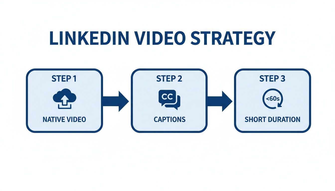
This simple flow is a perfect example of a repeatable system built from insights. Successful LinkedIn video strategy rests on three pillars: always uploading natively, including captions for the silent scrollers, and keeping it short to hold attention.
Set a Regular Content Review Cadence
For any of this to stick, you have to build a routine around it. A dedicated content review, whether it’s monthly or quarterly, is non-negotiable. This doesn't need to be some dreaded, day-long meeting. It can be a focused one-hour session to look at the data and make smart decisions.
During your review, you should be asking a few key questions:
- Performance vs. Goals: How did we stack up against the KPIs we set last quarter?
- Tops & Flops: What were our biggest hits and misses, and what can we learn from each?
- Strategic Adjustments: Based on this data, what are we changing about our content pillars, formats, and posting schedule for the next quarter?
This structured cadence forces your strategy to evolve based on real-world feedback from your audience. It stops you from running on old assumptions and keeps your content sharp and effective. By making this review a locked-in part of your workflow, you create a powerful feedback loop that drives continuous improvement.
Answering Your Top Questions About LinkedIn Content Analysis
Jumping into LinkedIn analytics can feel like trying to drink from a firehose. There's so much data, and it's easy to get lost. Let's clear up a few of the most common questions I hear so you can stop staring at spreadsheets and start making smarter content decisions.
How Often Should I Actually Check My Analytics?
This is a classic first hurdle. The best approach is to think in two different gears: short-term and long-term.
For any active account, a quick weekly check-in is a must. I usually look at the performance of individual posts within the first 72 hours—that’s the sweet spot for understanding initial traction on things like views, comments, and likes. This keeps you nimble and lets you react quickly.
But the real magic happens during a deeper monthly or quarterly review. This is where you zoom out to see the bigger picture. You’ll spot trends, identify which content pillars are actually resonating, and measure how you're tracking against your bigger business goals.
What’s a "Good" Engagement Rate on LinkedIn, Anyway?
Ah, the million-dollar question. The honest answer is... it's relative.
Industry chatter often throws around 2% or higher as the benchmark for a "good" engagement rate. Realistically, though, anything consistently above 1% is solid.
But here’s the thing: the most important number to watch isn't some generic industry average. It's your historical performance. Your primary goal should be to consistently beat your own average. If your posts usually hover around a 0.8% engagement rate, then hitting 1.2% is a massive win. It’s worth checking in regularly to calculate your engagement rate so you catch that kind of jump. It’s a clear signal that you’re onto something. Focus on outdoing yourself.
Don't be too quick to delete a post that bombs. A flop is just data in disguise. Instead of seeing it as a failure, treat it as a lesson in what your audience doesn't care about. Analyze it, learn from it, and let that insight sharpen your next piece of content.
Do I Really Need to Pay for Analytics Tools?
Not right away, no. You can get surprisingly far with LinkedIn’s built-in analytics, and they're completely free. It gives you all the core data you need to understand impressions, engagement, and the basic demographics of who's paying attention.
Paid tools become valuable when you need to level up your analysis or manage a larger-scale operation. If you are evaluating options, our comparison of the best social media analytics tools breaks down pricing, features, and ideal use cases for 12 platforms. They solve specific problems by offering more advanced features, like:
- Competitive Analysis: See what's working for others in your space and how your content measures up.
- Efficient Data Aggregation: Instead of juggling multiple screens, you get all your key metrics in one clean dashboard.
- Advanced Reporting: Build custom, professional-looking reports that are easy to share with your team or clients.
And if you're serious about tracking your brand's footprint, specialized LinkedIn mention tracker tools are a game-changer. They help you listen in on conversations about your brand that are happening outside of your own posts, giving you a much fuller picture of your influence. They’re powerful, but definitely not a day-one requirement.
Ready to turn your insights into high-impact content without the struggle? Postiv AI combines a brand-trained AI writer with a powerful carousel designer and analytics to help you create authority-building LinkedIn posts in minutes. Start your free trial today.